A cabinet colour can make the same kitchen feel calm and spacious, warm and welcoming, or surprisingly dark. That is why learning how to choose cabinet colour is less about picking a shade you like in a showroom and more about seeing how it will work with your light, worktops, flooring and daily routine.
For many homeowners, the cabinets are structurally sound but the finish feels dated. Respraying gives you the freedom to change the mood of the room without the cost, waste and disruption of removing a perfectly usable kitchen. The best colour is one that suits the room you have, rather than one that only looks good in a photograph.
Start with the elements you are keeping
Before looking at paint charts, identify the fixed features that will remain after the update. These usually include the worktop, floor, wall tiles, splashback, appliances and the overall colour of adjacent rooms. Cabinetry covers a large visual area, so it needs to connect these elements rather than compete with them.
A warm oak-effect floor, cream tiles and a beige or brown worktop tend to sit comfortably with warm whites, soft taupes, mushroom shades, olive greens and deeper charcoal tones with a warm undertone. By contrast, a grey stone-effect floor and crisp white worktop may suit cooler whites, pale greys, blue-greys or muted navy.
This does not mean every surface must match. A kitchen with too much of one tone can feel flat. The aim is a considered balance: one dominant neutral, one supporting tone and smaller accents through handles, taps, lighting or accessories.
Worktops often decide the direction
Worktops are particularly useful when narrowing down your options because they are costly and disruptive to replace. Look closely at their undertone, not just their main colour. A white worktop may have warm cream veining, cool grey veining or a slightly yellow cast. A black worktop can look soft and warm, or sharp and blue-black.
Hold cabinet colour samples directly against the worktop in daylight. If the sample makes the worktop look yellowed, pink or dull, it is probably not the right pairing. This simple test prevents a common disappointment: choosing a beautiful cabinet shade that exposes an unwanted undertone elsewhere in the kitchen.
How to choose cabinet colour for the light in your room
Natural light changes colour more than most people expect. A pale grey that looks clean and modern in a bright south-facing kitchen may appear cold in a north-facing room. A dark green can feel rich and elegant in a sunlit space, but heavy in a kitchen with small windows and limited lighting.
Check samples at several points during the day, including early morning and evening when artificial lighting takes over. Place them vertically on the cabinet doors if possible. Colour appears different on a vertical surface than it does lying flat on a table.
For kitchens with limited daylight, lighter shades are often the safest choice. Soft white, warm off-white, light greige and gentle sage can make the room feel more open while still offering more personality than plain brilliant white. Gloss and satin finishes can also reflect light, although the right sheen depends on the condition of the doors and the style you want to achieve.
In a large, naturally bright kitchen, darker cabinetry can create welcome depth. Deep navy, forest green, charcoal and near-black all work well when balanced by lighter worktops, walls or flooring. Dark cabinets show their character best when the surrounding surfaces give the eye somewhere to rest.
Choose a mood, not just a trend
Trends can be helpful for inspiration, but cabinet colours should last longer than a season. Ask what you want the room to feel like when you walk in each day.
Warm whites and soft neutrals create a timeless, airy finish. They are a strong option for smaller kitchens, traditional homes and anyone who wants flexibility when changing décor later. The trade-off is that very pale doors may show marks more readily around high-use areas, particularly near handles.
Greens offer a relaxed, grounded look and work especially well with timber, brass, stone and warm white surfaces. Sage is softer and easier to live with than a very bold green, while olive and deeper heritage greens can give a more confident, tailored result.
Blue is versatile, from gentle blue-grey through to classic navy. Dark blue cabinetry can look exceptionally smart with pale worktops, but it needs good lighting and may feel more formal than green. Greys remain practical, although choosing the wrong undertone can make a kitchen feel cool or lifeless. A warm grey or greige is usually more forgiving in Irish light than a blue-toned grey.
Black and very dark charcoal can be striking, particularly on an island or lower cabinets. In a compact kitchen, however, using these shades on every door can reduce the sense of space. It may be better to use a darker colour below the worktop and a lighter colour on wall cabinets.
Use contrast with purpose
Two-tone kitchens can add depth without committing the whole room to a strong colour. The most dependable approach is to keep upper cabinets lighter and use a deeper shade on lower cabinets or an island. This anchors the room while helping the upper half feel open.
Contrast also comes from hardware. Brushed brass handles bring warmth to green, blue and black cabinetry. Chrome or brushed nickel feels clean and contemporary with white, grey and blue-grey shades. Matte black handles can give pale cabinets definition, but in a traditional kitchen they may look too severe unless repeated in taps or lighting.
If your kitchen has an open-plan layout, take cues from the living or dining area. The cabinet colour does not need to match the walls next door, but it should belong to the same overall palette. A kitchen that feels disconnected from the rest of the home can look like an afterthought, even when the finish itself is excellent.
Think about maintenance and finish
Every colour has practical considerations. Very dark matt cabinets can show dust, fingerprints and splash marks, especially in busy family kitchens. Bright white may show stains and scuffs more clearly. Mid-tone colours such as sage, muted green, taupe and medium grey tend to disguise day-to-day marks well.
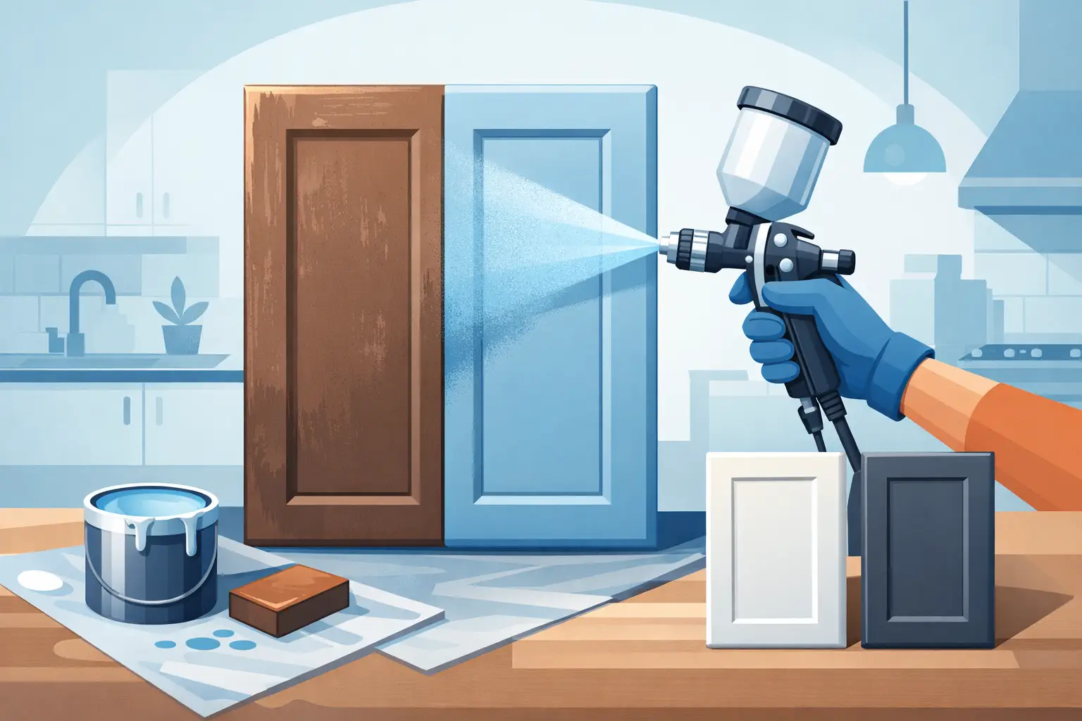
The finish matters too. A professional respray provides an even, durable surface that is difficult to achieve with a brush or roller, particularly on detailed doors. Satin is a popular middle ground because it has a subtle sheen, is easy to clean and does not highlight every imperfection. A higher sheen reflects more light but can draw attention to dents or unevenness in older cabinetry.
Durability is not only about the paint colour. Proper preparation, cleaning, sanding, priming and controlled spraying all influence how well the finish performs over time. Trusted specialists will assess the condition and material of your doors before recommending the most suitable approach.
Test before committing
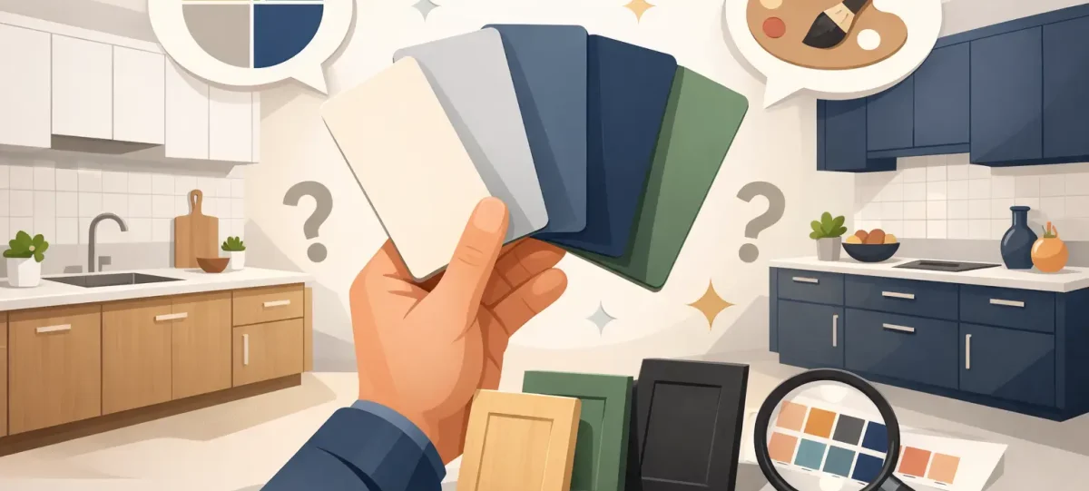
Never choose from a tiny colour chip alone. Order larger samples or paint sample boards, then view them beside the worktop, floor and tiles. Move them around the kitchen and photograph them in natural and artificial light. Photos can reveal whether a colour reads warmer, cooler, darker or more dominant than expected.
It also helps to reduce the choice to three realistic options. Too many samples make comparison harder, not easier. Once you know whether you are looking for a warm neutral, muted green or deep blue, decisions become far more straightforward.
If you are respraying existing cabinetry, a professional colour consultation can save time and uncertainty. Dublin Kitchen Respray helps homeowners assess how a chosen shade will work with the features already in place, making a high-impact update feel considered rather than risky.
The right cabinet colour should still look good after the initial excitement has passed. Choose the shade that works with your home’s light and fixed finishes, feels right for the way you live, and gives you a kitchen you will be pleased to use every day.