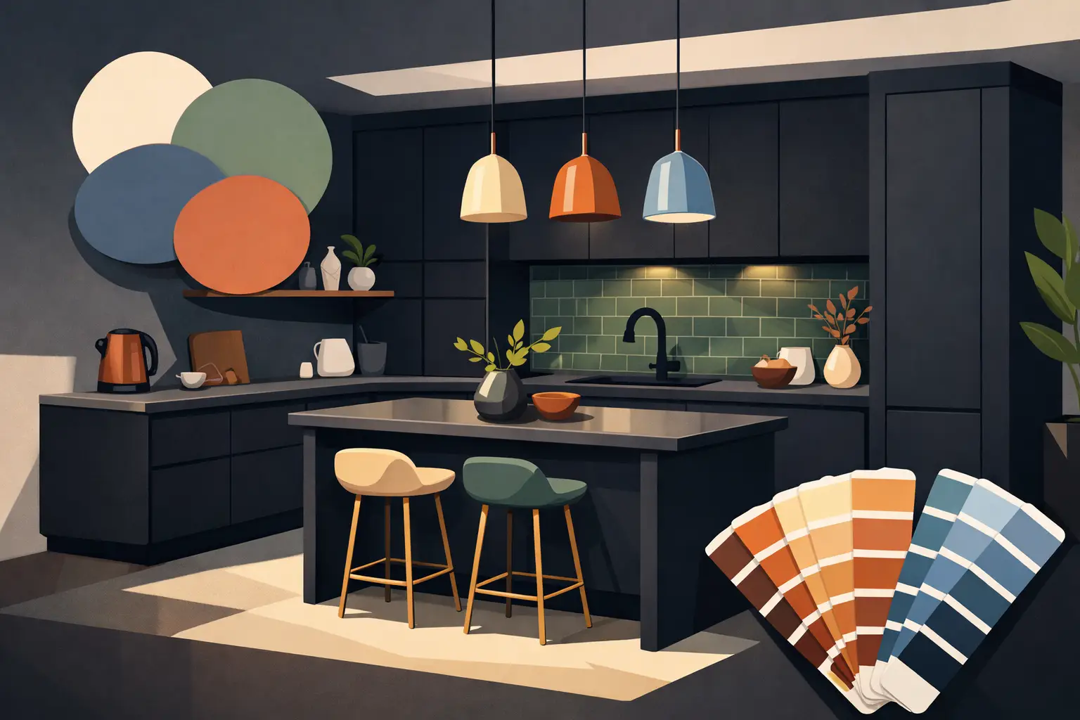
A dark kitchen can feel beautifully dramatic at 11am and surprisingly heavy by teatime. The best colours for dark kitchens do not simply make everything white. They balance the depth of the cabinetry, work with the natural light available and give the room a brighter, more welcoming feel without losing its character.
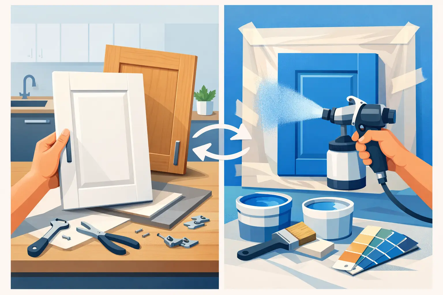
For many homes, the right colour scheme is also a practical alternative to replacing perfectly sound units. A professional respray can transform tired dark doors into a lighter, more considered finish, while keeping the layout, storage and appliances that already work well.
Why colour matters in a dark kitchen
Dark kitchen units absorb light, particularly in north-facing rooms, galley kitchens and spaces with small windows. This can make walls appear duller, worktops look heavier and the room feel more enclosed than it really is. The answer is not always to remove every dark surface. A well-chosen lighter or softer colour can create contrast and let the existing features look intentional.
Light also changes significantly throughout the day. Dublin homes often experience soft, cool daylight, which can make a grey-white look blue or a beige shade look slightly flat. Artificial lighting matters just as much. Warm under-cabinet lighting can make a neutral kitchen feel inviting, while cool white bulbs may sharpen greys and blues but leave creamier shades looking yellow.
Before settling on a colour, test a sample on a cupboard door or large card near the window, beside the worktop and under your usual evening lighting. A colour that looks perfect in a showroom or on a phone screen may behave very differently in your own kitchen.
The best colours for dark kitchens
Warm white for a clean, brighter contrast
Warm white is one of the most reliable choices when dark units make a kitchen feel closed in. Unlike brilliant white, it has a subtle cream, stone or ivory undertone that prevents the contrast from feeling stark. It works particularly well with dark walnut, espresso brown, black and charcoal cabinetry.
Choose a soft white for walls, splashbacks or resprayed upper cabinets if you want the room to feel more open. If the worktop is also dark, a warm white cabinet finish can lift the whole scheme. Keep the result crisp with brushed nickel, chrome or matt black handles, depending on the style of the room.
Pure white can still work in a modern kitchen with strong natural daylight, but it is less forgiving in a dim space. It can highlight shadows, marks and uneven lighting more readily than a softer off-white.
Greige and mushroom for understated warmth
Greige, mushroom and taupe are excellent choices for homeowners who want a lighter kitchen without the maintenance concerns or visual sharpness of white. These shades sit between grey and beige, bringing warmth to a dark room while still looking smart and contemporary.
A pale mushroom respray pairs particularly well with black granite-style worktops, dark wood flooring and stainless-steel appliances. It softens the contrast without competing with it. Greige is also a good solution where there are open-plan living areas, as it connects naturally with neutral furnishings and painted walls beyond the kitchen.
The key is undertone. A grey-heavy greige may feel cold in a north-facing room, while a yellow-heavy beige can look dated beside a cool grey worktop. Comparing samples directly against your fixed surfaces will quickly reveal which direction suits your kitchen.
Sage and muted green for calm character
Soft sage, eucalyptus and grey-green shades bring colour into a dark kitchen without making it feel busier. Green has an easy relationship with timber, brass, stone and black accents, so it can make older dark cabinets feel more current while retaining a relaxed, lived-in quality.
Muted green is especially effective when the kitchen has limited natural light but good warm lighting. It brings enough depth to feel purposeful, yet its softened grey base stops it from overwhelming the room. Pair sage cabinets with pale walls and a light worktop for the clearest lift, or use green on a feature island while keeping surrounding units neutral.
Avoid very deep forest green if the room is already struggling for light. It can look striking in a large kitchen, but in a compact space it may add another heavy surface rather than providing relief.
Dusty blue for a tailored, timeless finish
Dusty blue, soft denim and blue-grey offer a polished alternative to neutral shades. They are calmer and more versatile than bright navy, especially where dark cabinetry, dark tiles or dark flooring are already present.
A pale blue-grey can look fresh against warm oak or walnut details. It also sits well beside white quartz, pale stone-look worktops and brushed brass hardware. In kitchens that receive strong afternoon sun, a blue with a little grey prevents the colour from looking overly bright.
Blue is not the best answer for every dark kitchen. In a very cool, north-facing room, an icy shade can make the space feel less inviting. Choosing a dusty blue with a gentle green or grey undertone usually produces a more balanced result.
Soft clay, blush and warm neutral pinks
For a kitchen with dark brown, black or deep grey units, soft clay and muted blush can add warmth that white and grey sometimes lack. These are not bold pinks. Think pale terracotta, putty with a rosy undertone, or a light plaster shade.
Used thoughtfully, these colours make dark cabinetry feel richer and more considered. They work well with warm metals, natural timber and cream stone surfaces. A clay-toned wall can also be a practical way to lift a kitchen where you want to retain dark cabinets but change the overall mood.
Because these shades are more distinctive, use them with restraint. They tend to work best on walls, a single bank of cabinets or an island, rather than across every surface in a small room.
Choose the colour around the surfaces you are keeping
The most successful kitchen colour schemes begin with what cannot easily be changed. Worktops, floor tiles, splashbacks, appliances and even the window orientation should guide the decision. A beautiful cabinet colour can still look wrong if it clashes with a heavily patterned granite worktop or a cool-toned tiled floor.
If you are keeping a black or dark granite worktop, warm whites, mushroom, sage and muted clay are usually dependable choices. With a dark wood worktop, creamy whites, soft greens and dusty blues create enough contrast while respecting the warmth of the grain. Dark grey worktops generally suit greige, off-white and blue-grey finishes, though the exact tone depends on whether the grey reads warm or cool.
For kitchens with dated tiles, spray granite can be an effective way to bring the worktop, splashback or floor into a more cohesive scheme. Updating these large visual surfaces alongside cabinet colour can make the whole room feel professionally redesigned, rather than partially refreshed.
Cabinet colour, wall colour and contrast
A darker kitchen does not always need every cabinet resprayed in a pale shade. In some layouts, retaining lower dark units and lightening upper cabinets creates a balanced two-tone look. The darker base grounds the room and is practical around high-traffic areas, while the lighter upper section opens up the sightline.
Another option is to respray the cabinets in a mid-tone neutral such as mushroom or sage, then use a lighter wall colour to reflect more light. This often feels softer than white cabinets against white walls, particularly in family homes where a little warmth is welcome.
If you have an island, treat it as an opportunity rather than an afterthought. A pale main kitchen with a muted green, blue-grey or charcoal island can provide contrast without making the perimeter units feel dark. Conversely, in a kitchen with existing dark units, a lighter island can become the feature that breaks up the visual weight.
Common mistakes when lightening a dark kitchen
The first mistake is choosing colour in isolation. Always view samples beside the worktop, floor and splashback. The second is relying on one small swatch. Paint and sprayed finishes reveal their undertones more clearly over a larger area, especially in changing light.
It is also easy to overcorrect. Replacing dark cabinets with bright white, adding a glossy white splashback and using cool bulbs can make a kitchen feel clinical rather than bright. Layering soft neutral colour with good task lighting, a lighter surface and a considered finish is usually more effective.
Finally, do not overlook sheen. Matt and satin finishes are excellent at disguising minor imperfections and creating a contemporary look, but they absorb more light than high gloss. A satin cabinet finish often offers the most practical middle ground: refined, durable and easier to live with than a very glossy surface.
A practical route to a lighter kitchen
A full kitchen replacement can involve weeks of disruption, new plumbing or electrical work and unnecessary waste where cabinets are structurally sound. Respraying existing doors and units offers a more affordable, eco-friendly route to a significant change in colour and finish.
Dublin Kitchen Respray helps homeowners update existing cabinetry with expert preparation and durable sprayed finishes, giving dark kitchens a fresh, like-new appearance without the upheaval of a complete refit. The right shade is only part of the result: careful surface preparation and a professional finish are what make the colour look consistent and built to last.
Bring home a few large samples before making your final choice, and look at them on a bright morning and a dark evening. The colour that still makes the kitchen feel comfortable, practical and inviting in both will usually be the one you are happiest to live with.