A kitchen can feel dated long before it stops working well. Often, the cabinetry is still solid, the layout still suits the house, and what really needs attention is the finish. That is why choosing the best kitchen colours matters so much. The right shade can brighten a dark room, soften a busy space, or make a well-used family kitchen feel far more polished without the cost and upheaval of a full replacement.
For most homeowners, colour is not just about taste. It is about light, maintenance, longevity, and whether the room still looks good in two or three years. A striking shade might catch your eye on a screen, but kitchens are practical spaces. They need colours that work on a rainy Tuesday morning as well as they do in a styled photo.
How to choose the best kitchen colours
The best starting point is not a trend report. It is your room. Natural light, floor finish, worktop tone, wall colour and even the direction the kitchen faces all affect how paint appears. A green-grey that looks calm in a bright south-facing kitchen may feel heavy in a room with limited daylight.
It also helps to think about scale. Dark colours can look stunning on a large run of modern cabinetry with plenty of space around it. In a compact kitchen, that same shade may feel too dominant unless it is balanced with lighter walls, reflective surfaces or open shelving. There is no single perfect answer, which is why the best results usually come from matching colour to the space rather than chasing what is fashionable.
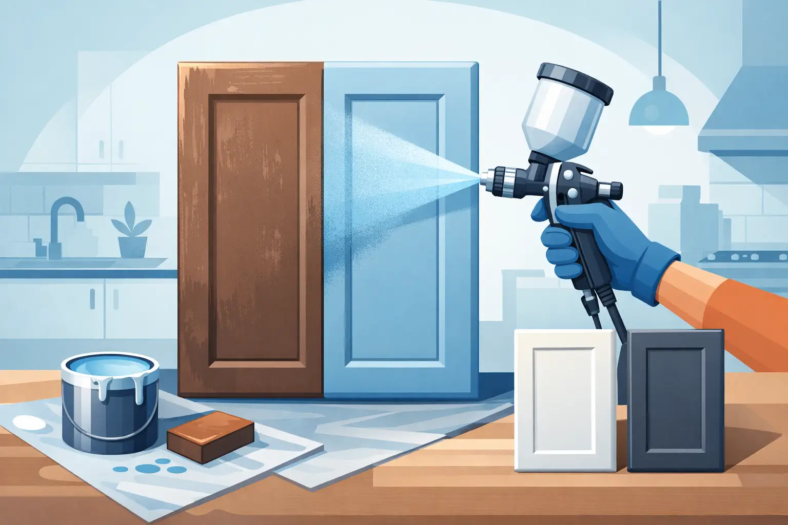
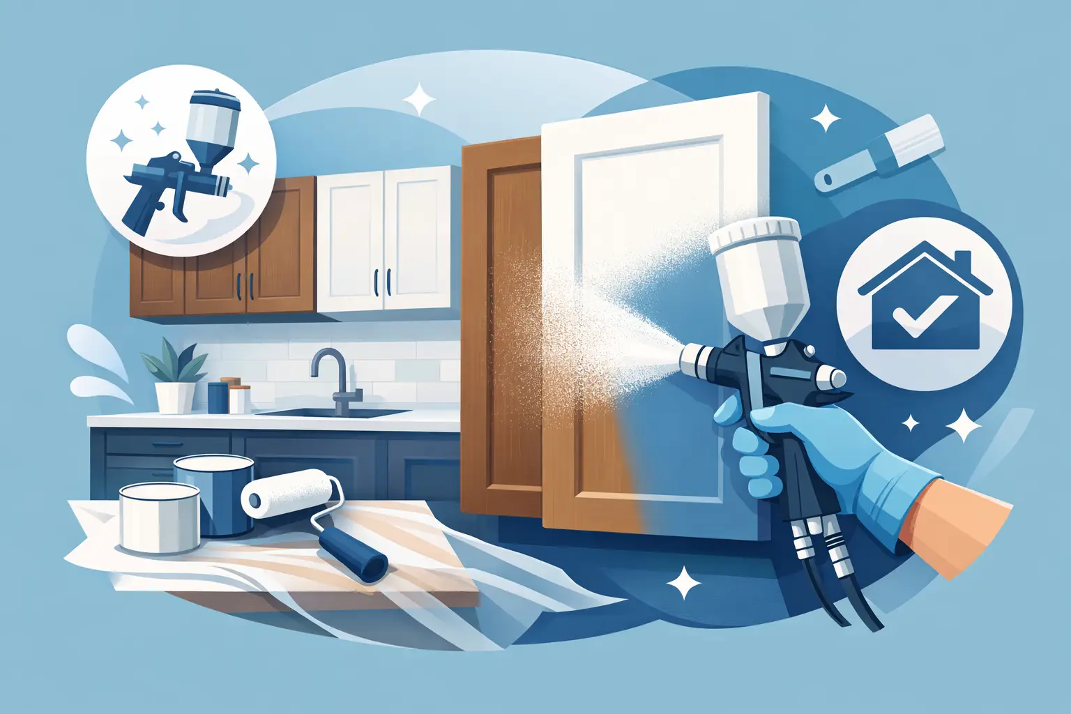
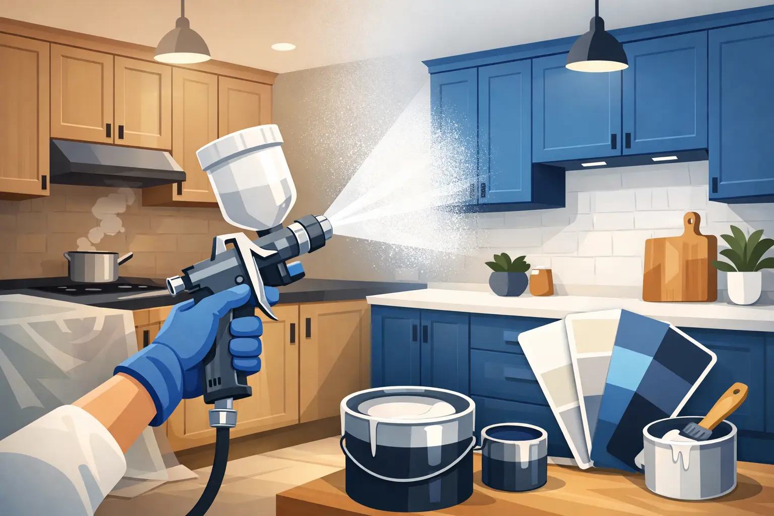
Finish plays a part too. A professionally sprayed finish tends to give colour more depth and consistency than a brush-applied alternative, especially on cabinet doors. That matters with softer neutrals and deeper tones, where patchiness is far easier to spot.
Best kitchen colours that work in real homes
Soft white
White remains one of the best kitchen colours for a reason. It is clean, versatile and excellent at reflecting light. In smaller kitchens or homes where daylight is limited, it can make the whole room feel more open.
That said, not every white works. Bright, stark whites can feel cold, particularly under cooler artificial lighting. Softer whites with warm or neutral undertones are often easier to live with. They also sit more comfortably alongside timber flooring, stone-effect worktops and brass or black handles.
Warm greige
Greige, the point where grey meets beige, has become a dependable choice for homeowners who want something neutral without looking flat. It has enough warmth to feel inviting and enough depth to add character.
This is a particularly smart option if you want a kitchen that feels current but not trend-led. It suits both classic shaker doors and simpler contemporary styles. It is also forgiving, which matters in a hard-working kitchen where fingerprints and everyday wear are part of life.
Sage green
Sage green has earned its place among the best kitchen colours because it brings colour into the room without shouting for attention. It feels calm, fresh and very easy to pair with natural materials.
It works especially well in Irish homes where the light can shift throughout the day. In softer daylight, sage often reads as relaxed and elegant rather than overly green. Combined with oak, warm white walls or stone-effect surfaces, it creates a kitchen that feels settled and considered.
Deep navy
Navy is one of the strongest choices for adding richness and contrast. It can make cabinetry look bespoke and expensive, particularly when paired with lighter worktops or metallic details.
The trade-off is that navy needs the right setting. In a darker kitchen, using it on every cabinet may make the room feel enclosed. One practical approach is to use navy on lower units or an island, while keeping upper cabinets lighter. That gives depth without sacrificing brightness.
Charcoal grey
Charcoal has a modern, architectural quality that suits sleek kitchens beautifully. It is more forgiving than black, but still gives that dramatic, high-end effect many homeowners want.
It tends to work best where there is good natural light or where the room is open-plan and balanced by pale walls or flooring. If your kitchen is small and enclosed, charcoal can still work, but usually in moderation. Used thoughtfully, it creates contrast and structure rather than heaviness.
Dusty blue
For homeowners who want colour without going too dark, dusty blue is a strong middle ground. It feels softer than navy, more distinctive than grey, and brings a slightly classic touch to cabinetry.
This shade often suits period homes and transitional kitchens particularly well. It has enough personality to refresh the space, but it is not so bold that it dates quickly. That makes it a sensible long-term choice.
Olive green
Olive green is warmer and earthier than sage. It has a grounded look that pairs beautifully with timber, cream walls and textured finishes. If you want a kitchen with a bit more depth and character, olive can be an excellent option.
The key is balance. On very traditional cabinetry, a muddy olive can feel heavy if the rest of the room is also dark. With the right undertones and a professional finish, though, it can look stunning and refined.
Taupe
Taupe is often overlooked, but it is one of the most reliable kitchen shades available. It offers warmth, softness and sophistication without feeling too yellow or too grey.
For homes where the kitchen connects to living or dining areas, taupe is particularly useful because it blends well with a wide range of interiors. It also tends to age gracefully, which is important if you want the update to last.
Pale mushroom
Pale mushroom sits close to taupe and greige, but with a slightly softer, more understated look. It is ideal for homeowners who want a light kitchen with more warmth than white can offer.
This kind of shade can make cabinetry feel elegant rather than plain. It also works very well when respraying older kitchens, because it refreshes the room while still suiting existing tiles, floors or worktops.
Black accents and two-tone schemes
While full black kitchens are not for everyone, black has a place among the best kitchen colours when used strategically. A black island, lower cabinets, or even a combination of black and warm neutral units can look striking and contemporary.
Two-tone kitchens are often the most practical way to introduce stronger colours. They allow you to add depth and style without committing the entire room to a dark finish. This approach also helps break up larger kitchens, making them feel more tailored.
Best kitchen colours for different conditions
If your kitchen is small, lighter shades usually give the best return. Soft white, pale mushroom and warm greige help bounce light around and reduce visual clutter. They are especially effective where cabinets take up most of the wall space.
If your kitchen lacks natural light, warmth matters more than brightness alone. Cool greys can appear dull in these rooms, whereas greige, taupe or sage often feel softer and more welcoming. Artificial lighting should be considered as part of the decision, because it can shift undertones dramatically.
If you have a large open-plan kitchen, you have more freedom. Deeper shades like navy, olive and charcoal can anchor the space and add definition. In these settings, darker cabinetry often looks intentional rather than overpowering.
If your worktops and flooring are staying as they are, colour selection becomes more precise. A beautiful cabinet shade can still look wrong if it clashes with warm-toned granite, grey tile or timber with orange undertones. This is one reason many homeowners prefer expert advice before committing to a respray.
Trends matter less than staying power
Kitchen trends come and go quickly. A colour that looks fresh this year may feel overdone not long after. For most homeowners, the better question is not what is currently popular, but what will still feel right after daily use, changing seasons and years of family life.
That does not mean playing it safe to the point of boredom. It means choosing colour with context. A trusted respray specialist will usually guide you towards shades that suit your cabinetry style, your lighting and the finish you want to achieve. In many cases, the most successful kitchens are not the boldest. They are the ones where everything feels balanced.
For homeowners in Dublin and surrounding areas, this is often where a professional respray makes the biggest difference. Good preparation, expert spraying and a durable finish allow even subtle colours to look stunning, sharp and fully transformed.
The best kitchen colours are the ones that make your space feel brighter, smarter and easier to enjoy every day. If a shade can do that while working with what you already have, it is probably the right one.