If your kitchen is starting to feel tired, cabinet colour trends 2027 offer a useful clue about where design is heading – and, just as importantly, what will still look good a few years from now. The strongest shift is away from cold, flat finishes and towards colours with more warmth, depth and character. For homeowners who want a fresh look without the cost and disruption of a full refit, that matters.
What we are seeing is not a rush towards novelty for its own sake. The most convincing kitchens in 2027 will balance fashion with longevity. That means colours that feel current, but still sit comfortably with stone-effect worktops, timber flooring, brushed metal hardware and the everyday reality of family life.
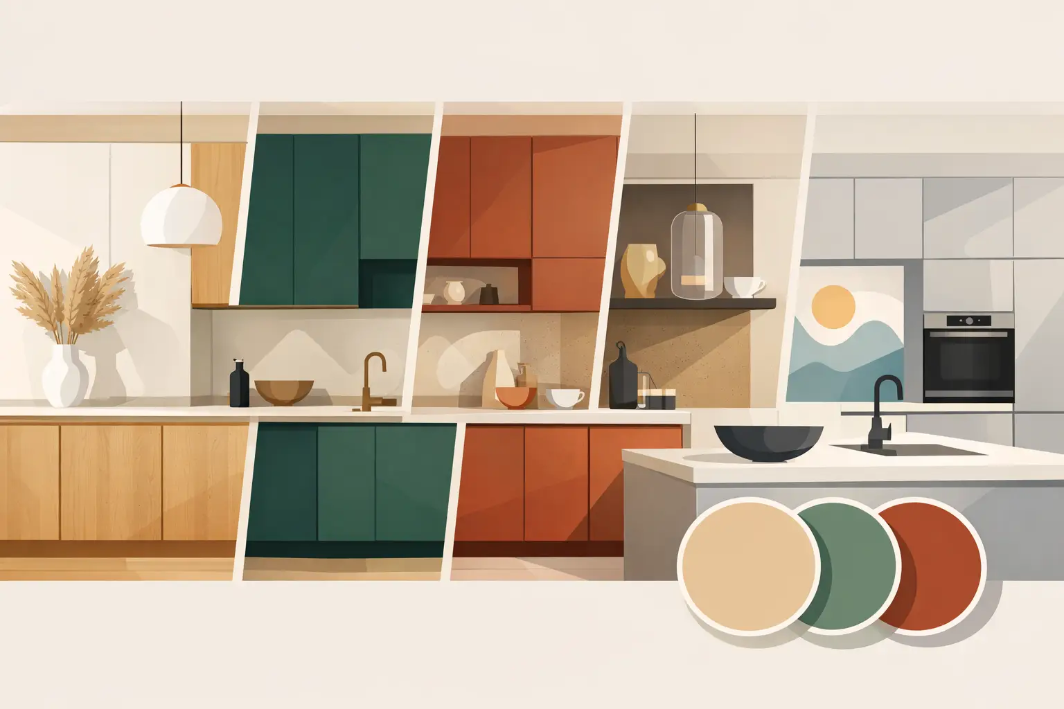
Cabinet colour trends 2027 are getting warmer
For years, stark whites and cooler greys dominated kitchen design. They delivered a crisp, clean look, but many spaces ended up feeling slightly clinical, especially in homes with limited natural light. In 2027, warmer shades are taking over because they make kitchens feel more settled and more liveable.
Soft putty, mushroom, taupe and greige are leading this move. These shades work well because they are neutral without looking bland. They also adapt nicely to different lighting conditions, which is a real advantage in British and Irish homes where daylight can shift dramatically across the day.
There is a practical benefit too. Warm neutrals tend to be more forgiving than brilliant white when it comes to fingerprints, minor marks and everyday wear. If you are updating existing cabinetry rather than replacing it, these tones can give a kitchen a more expensive feel without shouting for attention.
The new neutrals are softer, not dull
A well-chosen neutral in 2027 is not simply beige by another name. It has subtle undertones that add depth. Some lean slightly pink, some have a hint of clay, and others sit closer to warm stone. That nuance is what stops the kitchen looking flat.
The trade-off is that undertones matter more than people expect. A taupe that looks elegant in one home can appear muddy in another if the flooring, splashback or worktop clashes with it. Testing colour in the actual room is always worth doing, especially if your kitchen faces north or has older warm bulbs.
Green remains strong, but it is maturing
Green has been popular for some time, and it is not disappearing in 2027. What is changing is the type of green people are choosing. Instead of bright statement shades, homeowners are moving towards deeper olive, eucalyptus, moss and muted sage.
These colours suit cabinetry particularly well because they feel grounded. They bring personality into the kitchen while still reading as sophisticated and usable. Paired with warm metallic handles, wood accents or light stone surfaces, a muted green can look striking without becoming overwhelming.
For larger kitchens, darker greens can add real presence. In smaller rooms, they can still work beautifully, but the finish and surrounding materials become more important. Too many heavy elements in one compact space can make the room feel closed in. In those cases, a softer sage on all units, or a darker green used only on the island or lower cabinets, often gives a better result.
Why green keeps working
Green connects easily with natural materials and has a calming quality that suits kitchens. It also bridges traditional and modern styles better than many trend-led colours. A shaker kitchen, for example, can carry an olive tone just as well as a flatter, more contemporary door style.
That versatility is a big reason it continues to perform. A trend lasts longer when it can adapt to different homes rather than demanding a very specific look.
Earthy reds and browns are coming through
One of the more interesting developments in cabinet colour trends 2027 is the return of earthy, red-based tones. Think terracotta, clay, cinnamon and softened auburn rather than anything glossy or loud. These colours add warmth and individuality, particularly in kitchens that need a bit more character.
They are not for every home, and they need careful handling. Used across every cabinet, they can feel too heavy in a room with little natural light. But as a feature colour, or balanced with lighter wall cabinets and neutral surfaces, they can create a refined and welcoming space.
Brown is also being reconsidered. Not the dark, orange-heavy wood tones that many people still associate with dated kitchens, but smoother cocoa, walnut-inspired and mushroom-brown painted finishes. In the right setting, these shades feel calm, architectural and current.
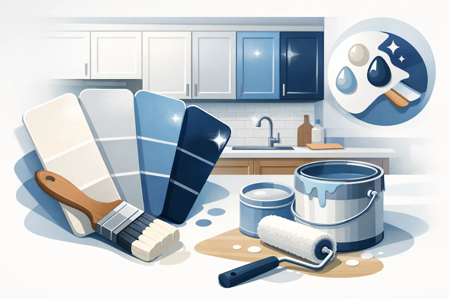
Blue is still relevant, but less icy
Blue is not disappearing either, though its cooler versions are losing ground. Navy remains dependable, especially in classic kitchens, but the newer direction is softer and dustier. Slate blue, storm blue and blue-grey with warm undertones are becoming more popular because they are easier to live with than brighter or sharper options.
This is particularly useful if you want colour without committing to green or terracotta. A muted blue can still add contrast and depth while remaining familiar. It pairs well with quartz-style worktops, brushed brass, black fixtures and pale timber details.
The caution with blue is similar to grey. If the undertone is too cold, the kitchen can start to feel dated quite quickly. The best 2027 blues have a touch of softness that keeps the room comfortable rather than stark.
Two-tone kitchens are becoming more subtle
Two-tone cabinetry is still very much in play, but the contrast is gentler than it was a few years ago. Instead of a dramatic black-and-white split, 2027 favours combinations that sit closer together. A warm neutral on upper cabinets with olive or taupe below, for instance, feels more composed and less trend-driven.
This softer approach works well because it creates interest without making the kitchen feel busy. It can also solve practical design problems. Darker lower units ground the room and hide wear more effectively, while lighter wall cabinets keep the space open.
For homeowners updating an existing kitchen, this is often one of the smartest routes. You can introduce a stronger colour without fully committing the whole room to it.
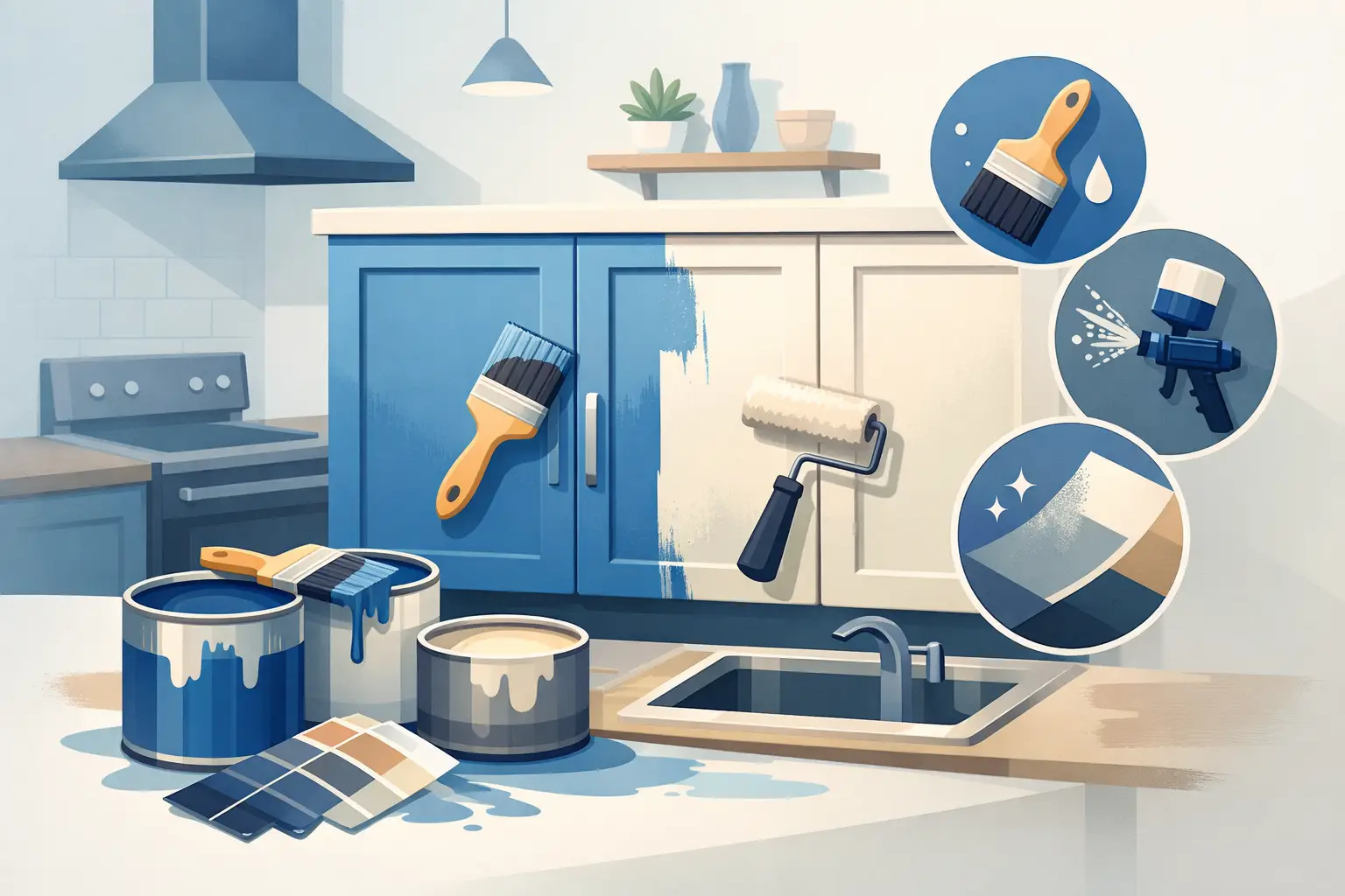
Finish matters as much as colour
When people talk about trends, they often focus only on shade. In reality, sheen level and finish have a huge effect on how a cabinet colour is perceived. In 2027, the move is generally towards smoother, lower-sheen finishes that give colour more depth and a more premium look.
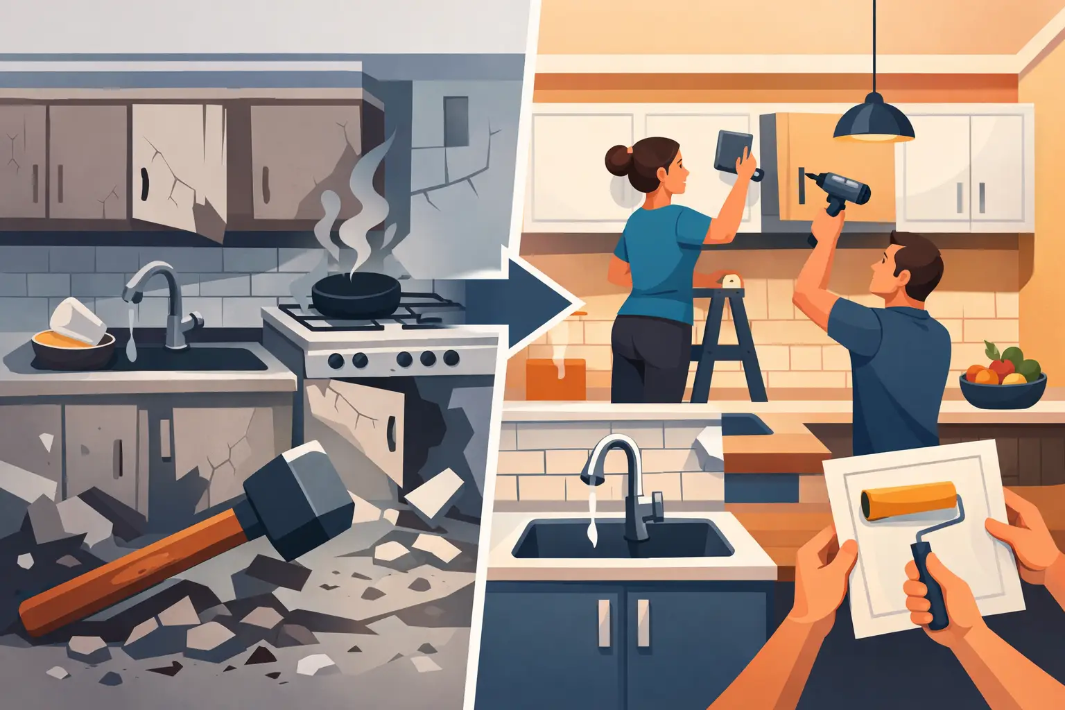
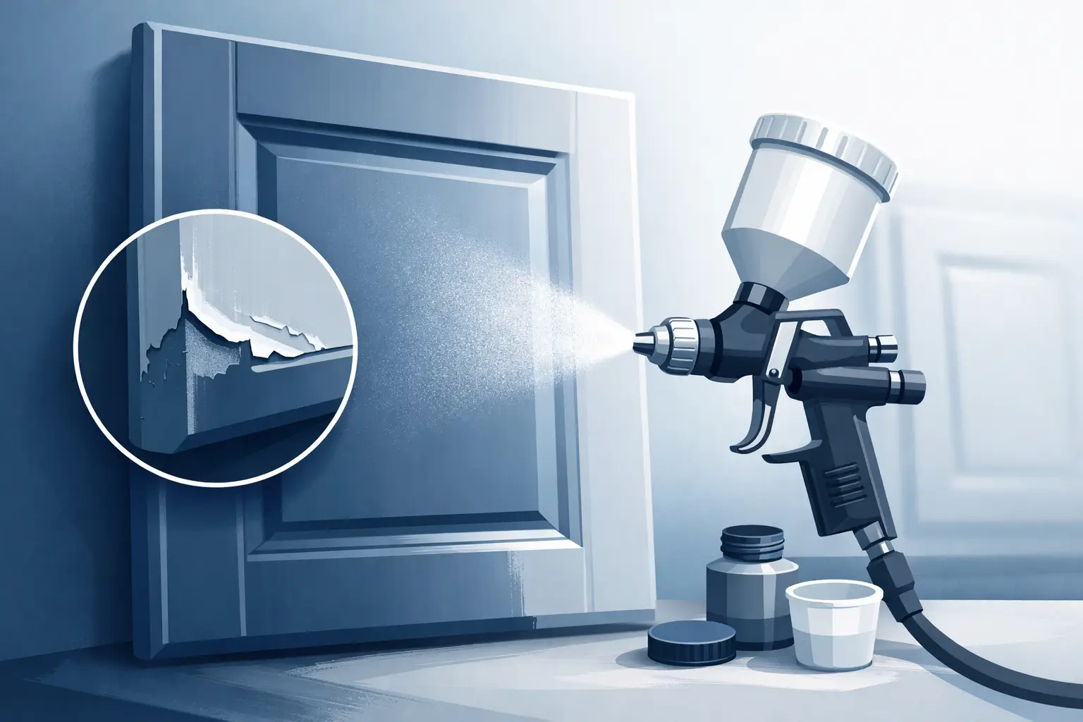
Highly reflective finishes can make certain colours appear harder and less forgiving. A softer finish tends to look more contemporary and also helps disguise small imperfections. That is particularly relevant if you are breathing new life into existing cabinetry through professional respraying rather than starting from scratch.
A trusted respray can completely change how a dated kitchen reads. The same cabinet doors that once looked tired in old-fashioned oak or worn white can feel current and tailored with the right colour and finish. For many households, that is the sweet spot – a stunning result, less upheaval, and far better value than replacement.
How to choose a 2027 cabinet colour that will last
The safest approach is not to chase the boldest trend. It is to look at what already exists in your kitchen and choose a colour that improves the whole scheme. Flooring, worktops, wall colour, natural light and even the age of the property all play a part.
If your room is dark, a deep dramatic colour may still work, but usually with enough lighter contrast around it. If your kitchen gets plenty of daylight, you have more flexibility with richer tones. If resale is on your mind, warm neutrals and muted greens are generally a steadier bet than more fashion-led reds or browns.
There is also the question of how often you want the room to change. Some homeowners love a distinctive look and are happy to update accessories and walls around it over time. Others want a colour that will quietly hold its own for years. Neither approach is wrong, but being honest about that from the outset usually leads to a better decision.
What cabinet colour trends 2027 mean for real homes
The clearest message from cabinet colour trends 2027 is that kitchens are becoming more personal and more comfortable. People still want a polished finish, but they also want warmth, texture and colours that feel considered rather than showroom-perfect.
That is good news if you are planning a kitchen refresh. You do not need to rip everything out to achieve a more current look. Often, the biggest change comes from rethinking the cabinetry you already have and choosing a colour that suits your home properly, not just the latest photo online.
The best kitchens in 2027 will not be the ones chasing every passing idea. They will be the ones that feel balanced, well-finished and easy to live with every day. If a new cabinet colour can give you that, it is doing far more than following a trend.