Choosing cabinet colour ideas sounds simple until you stand in your kitchen and realise the wrong shade could make the room feel cold, cramped or dated. The right colour does far more than freshen up doors – it changes how the whole space feels, and it can do it without the cost, mess or waste of a full renovation.
For most homeowners, the best approach is not chasing whatever is fashionable this month. It is about finding a colour that suits your light levels, worktops, flooring and the way you actually use the room. A busy family kitchen needs something different from a calm open-plan space, and a north-facing room will behave very differently from one flooded with sun.
How to choose cabinet colour ideas that suit your kitchen
Before looking at specific shades, it helps to think practically. Natural light is one of the biggest factors. In darker kitchens, very deep colours can look sophisticated, but they can also absorb light and make the room feel smaller if they are not balanced well. In brighter spaces, richer tones often look more settled and luxurious.
Your existing elements matter just as much. Flooring with warm timber tones tends to sit comfortably with off-whites, taupes, greens and softer greys. Colder quartz or marble-effect surfaces often pair better with crisp whites, charcoals and cleaner blue-greys. If your tiles, splashback or worktop are staying, the cabinet colour needs to work with them rather than fight for attention.
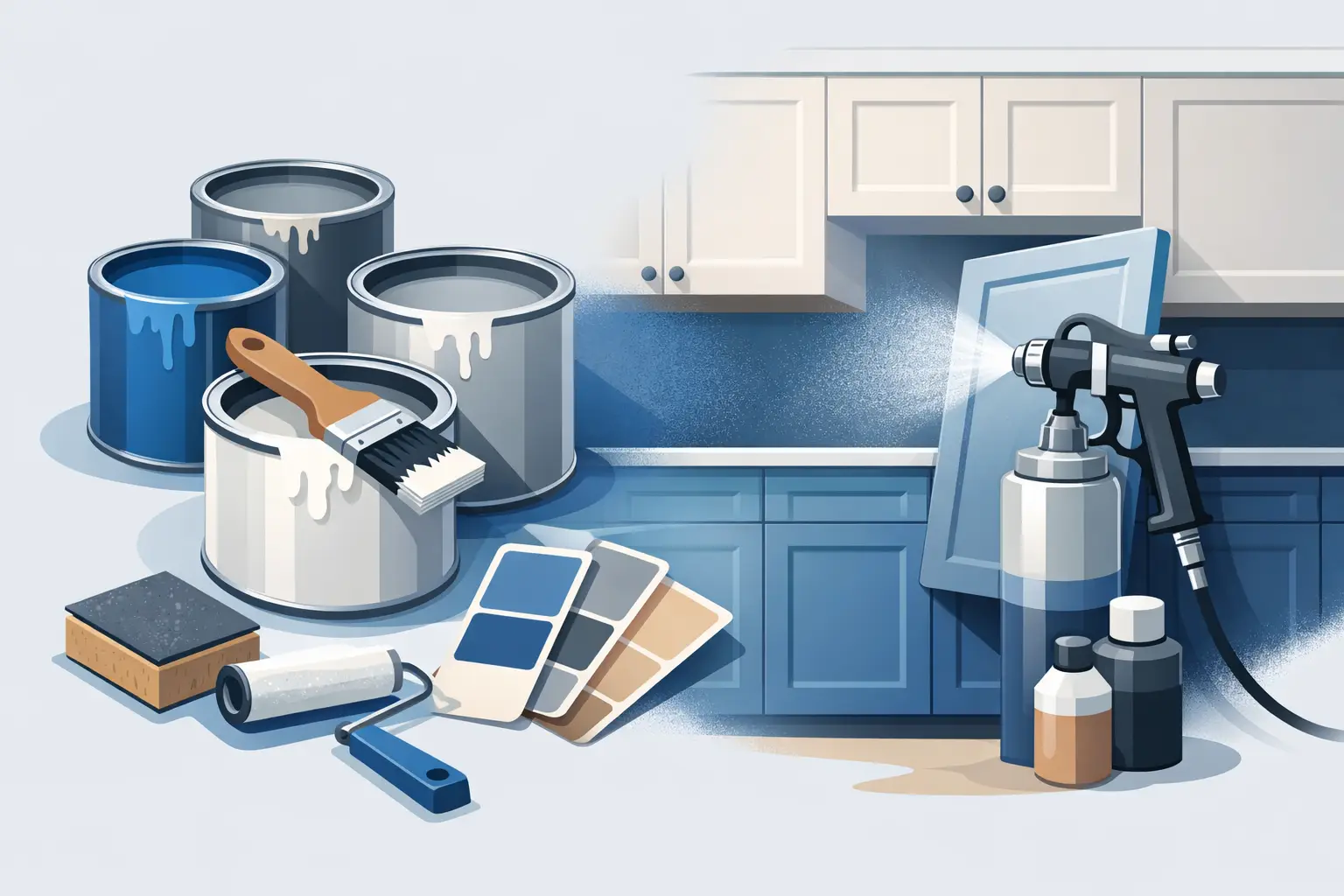
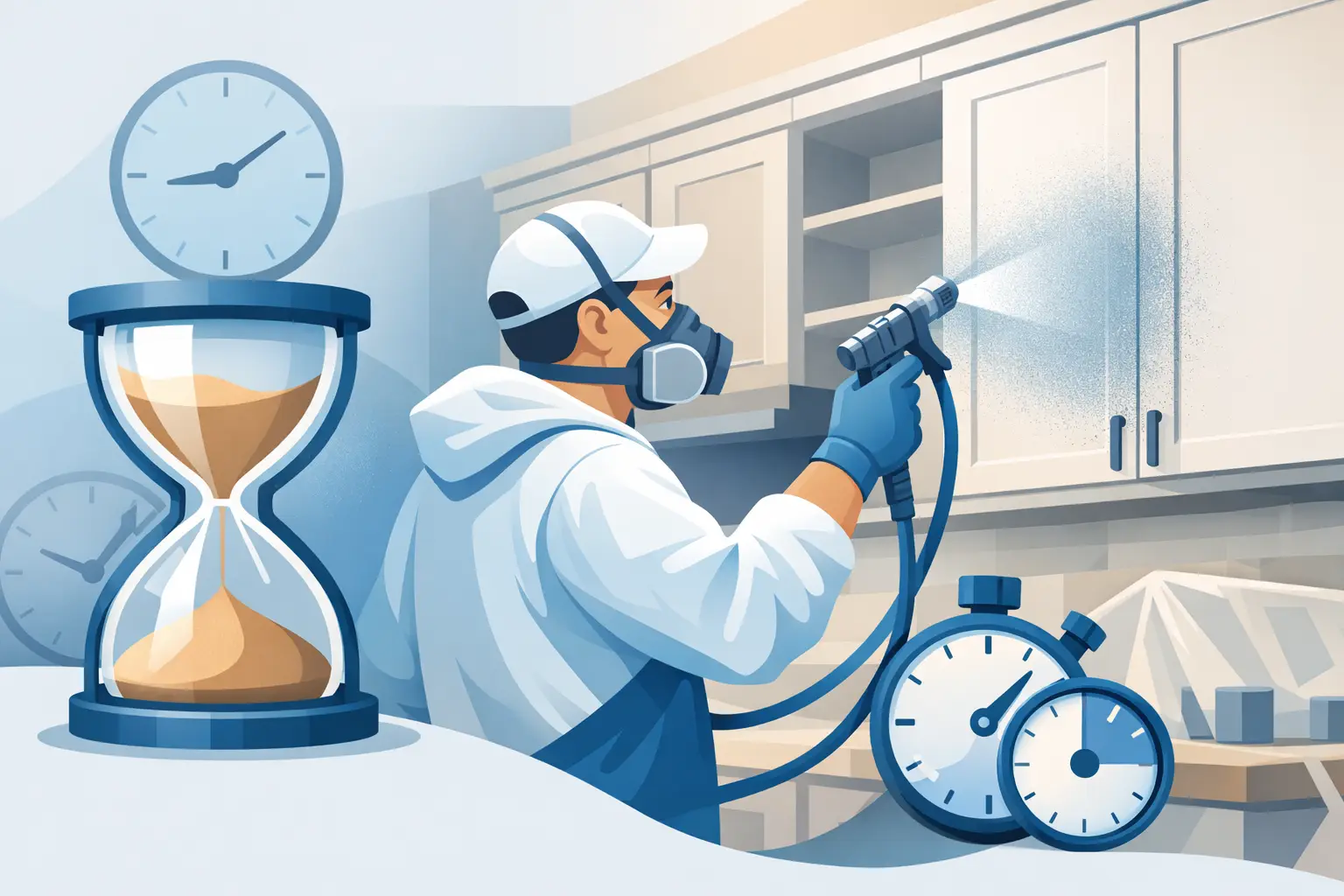
Finish also changes the result. A professional sprayed finish gives a smoother, more consistent look than brush painting, and that matters most with modern kitchens where every imperfection shows. Matte and satin finishes are usually the safest choice because they feel current without looking flat or overly shiny.
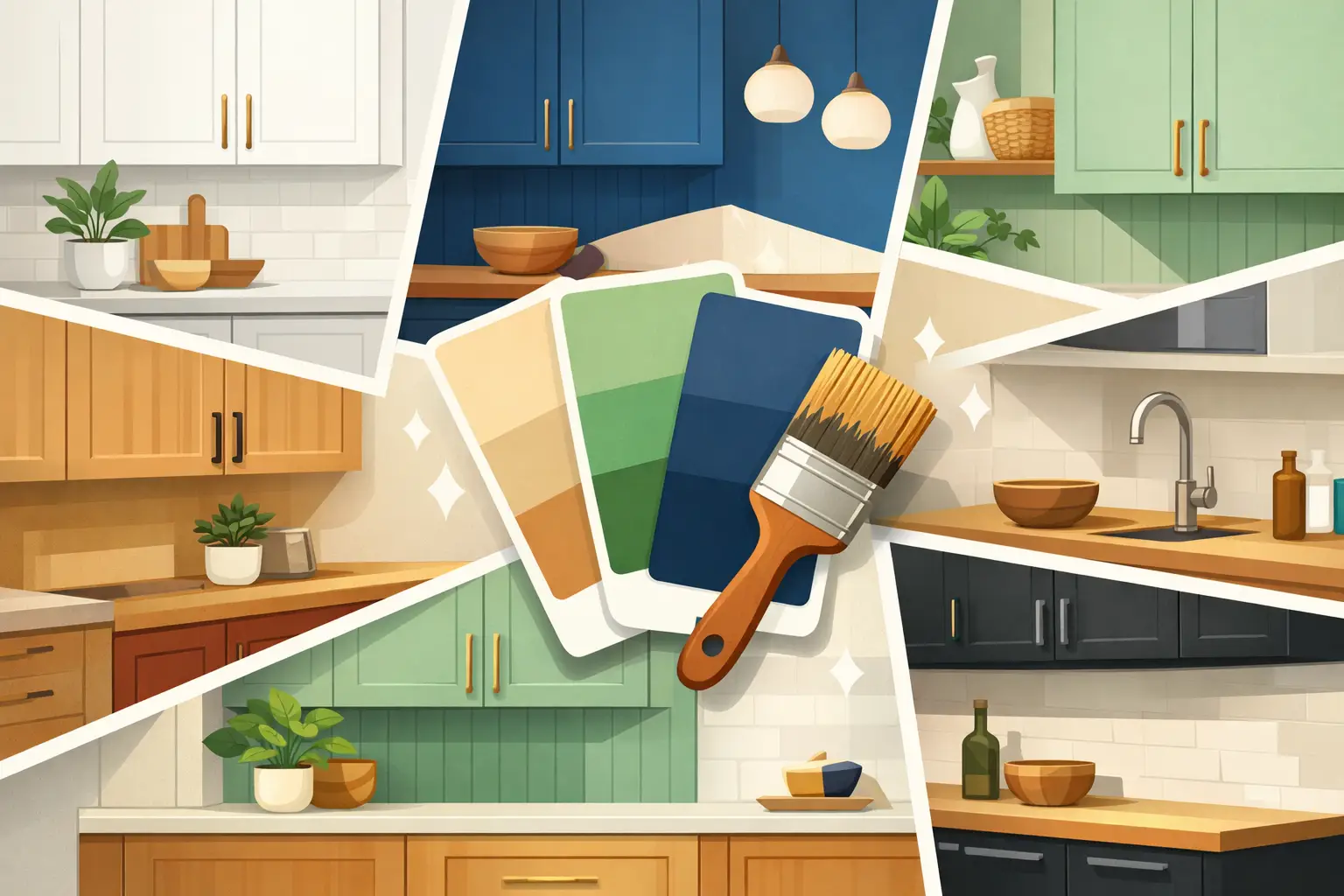
12 cabinet colour ideas worth considering
1. Warm white
Warm white remains one of the most reliable choices because it brightens a kitchen without feeling stark. It works especially well in homes where the goal is a cleaner, fresher look rather than a dramatic redesign.
The key is choosing a white with a soft undertone. Pure brilliant white can feel clinical under certain lighting, while a warmer white looks more welcoming and tends to sit better with timber floors and cream walls.
2. Soft greige
Greige sits between grey and beige, which makes it incredibly versatile. It suits classic shaker kitchens, contemporary flat-panel doors and everything in between.
This is often a smart option for homeowners who find grey too cold but do not want a fully cream kitchen. It gives a refined, modern feel without being overly trend-led.
3. Sage green
Sage has become popular for good reason. It brings softness and colour into a kitchen without overwhelming the space, and it pairs beautifully with brass handles, oak details and stone-effect worktops.
It is particularly effective in kitchens that need warmth and character. In a respray, sage can make older cabinetry feel current again while still looking timeless.
4. Deep navy
Navy is one of the strongest darker options for cabinetry. It adds depth and contrast, and it can make a kitchen feel instantly more polished.
That said, navy works best when the room has enough light or when it is balanced with pale walls, lighter worktops or open shelving. In a very small or dark kitchen, full navy can feel heavy, so it may be better used on lower cabinets or an island.
5. Charcoal grey
Charcoal delivers a more architectural look than mid-grey. It suits modern kitchens very well and works especially nicely with white quartz, brushed steel and black fixtures.
The trade-off is that it shows dust, marks and fingerprints more readily than lighter shades, particularly on busy cabinets. If you love the look but want something a touch softer, a smoky graphite can be a practical compromise.
6. Dusty blue
Dusty blue has a calmer, more relaxed feel than stronger navy tones. It adds personality without dominating the room, which makes it a good fit for family kitchens and open-plan spaces.
This shade can work well in Irish homes where the light is often softer and cooler. A blue with a muted, greyed-down base tends to look more elegant than anything too bright or sugary.
7. Taupe
Taupe is understated, but that is exactly its strength. It creates a warm, tailored look and works well with both modern and traditional details.
If you want a kitchen that feels expensive but not showy, taupe is worth serious consideration. It also tends to age well because it is not tied too closely to one trend cycle.
8. Forest green
Forest green is richer and moodier than sage, and it can look stunning in the right setting. It pairs beautifully with warm metals, natural wood and lighter stone surfaces.
This is a colour for homeowners who want something distinctive but still grounded. In smaller kitchens, it is often best used carefully, as too much dark green can reduce the sense of space.
9. Cream
Cream has made a quiet return, especially in homes where a softer, more traditional feel is wanted. Done well, it is far removed from the yellow-toned finishes that can make older kitchens look tired.
A modern cream should feel clean, muted and gentle. It suits period homes, shaker doors and spaces where stark white would feel too sharp.
10. Black
Black cabinetry can look exceptional, but it needs confidence and balance. In the right room, it creates a striking, high-end finish that feels modern and deliberate.
It is not the easiest option for every kitchen. Black can highlight grease, dust and fingerprints, and in rooms with limited daylight it may feel too severe. Used on an island or lower cabinets, however, it can be extremely effective.
11. Two-tone combinations
Some of the best cabinet colour ideas are not single colours at all. Two-tone kitchens, such as lighter upper cabinets with darker lowers, can solve practical design problems while adding interest.
This approach helps keep a kitchen feeling open at eye level while grounding the lower half of the room. White and navy, cream and green, or greige and charcoal are all combinations that can work beautifully when the tones are balanced properly.
12. Soft mushroom
Mushroom tones sit in that useful middle ground between beige, taupe and grey. They are subtle, adaptable and particularly good in kitchens where several finishes already exist.
Because the colour is complex rather than flat, it tends to work with a wider range of worktops and floors. It is an excellent choice if you want something neutral but more interesting than white.
Which cabinet colours work best in smaller or darker kitchens?
In smaller kitchens, lighter shades usually give the best return because they reflect more light and help the room feel less enclosed. Warm white, soft greige, cream and mushroom are often the safest options.
That does not mean dark colours are off the table. They can still work, but they need support from the rest of the room. Pale walls, reflective surfaces and good lighting make a big difference. If you love deeper shades, using them on lower units only can give you the richer look without shrinking the space visually.
Cabinet colour ideas for modern and classic styles
Modern kitchens tend to suit cleaner, more controlled colours. Charcoal, taupe, dusty blue, black and crisp off-whites all work well when paired with simple hardware and a smooth sprayed finish.
Classic kitchens usually benefit from softer, more layered shades. Sage green, cream, mushroom and warm white are especially effective on shaker-style doors because they highlight the detail without making the design feel busy.
This is where expert colour guidance matters. A shade that looks ideal on a sample card can shift significantly once applied across a full run of cabinetry. Light direction, ceiling height and surrounding finishes all affect the final impression.
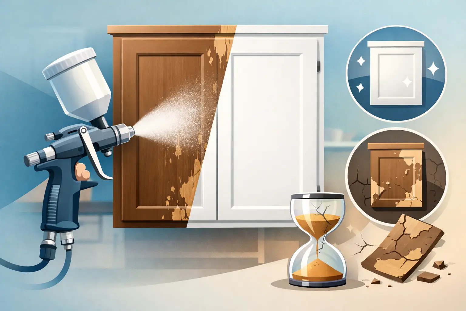
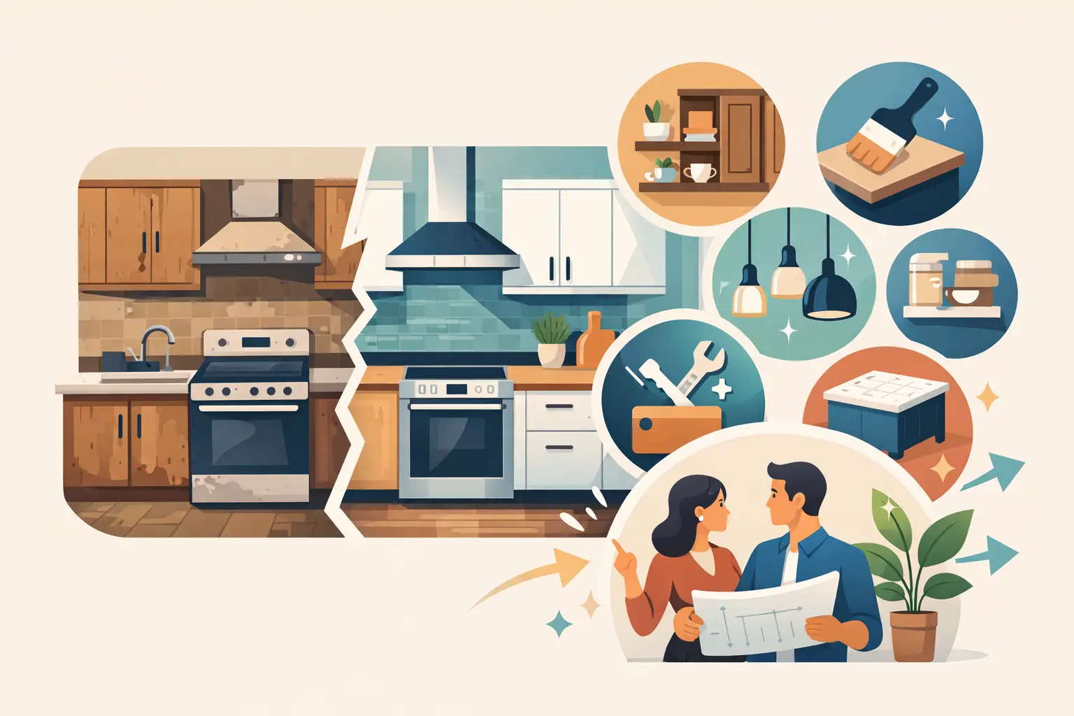
Why respraying makes colour changes more practical
If your cabinets are structurally sound, changing the colour through a professional respray is often the most sensible route. You get the visual impact of a new kitchen without the upheaval of ripping out perfectly usable units.
That is one of the reasons homeowners across Dublin and nearby counties increasingly choose respraying over replacement. It is more affordable, far less disruptive and a more eco-friendly way to update the heart of the home. When carried out properly, the finish looks smooth, durable and completely refreshed.
The biggest advantage is flexibility. Instead of living with dated timber tones or worn painted doors, you can choose a colour that suits your home now. Whether that means a brighter neutral, a softer green or a darker contemporary shade, the transformation is significant without being excessive.
The best cabinet colour is usually the one that still feels right after the first impression fades. Trends can inspire, but a kitchen is used every day, often for years. Choose a shade that suits your light, your home and your routine, and the result will feel right long after the paint has dried.