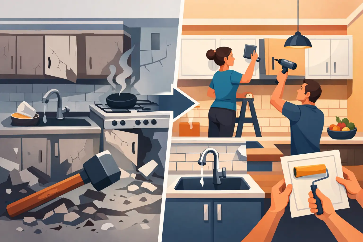
A small kitchen can feel cramped for two very different reasons. Sometimes it genuinely lacks space. More often, though, the room is working against itself because the colour is too heavy, too cold, or simply wrong for the light it gets. Choosing the best colours for small kitchens is less about following trends and more about making the room feel brighter, calmer and better proportioned.
That matters even more when you want a fresh result without the cost and upheaval of a full renovation. A well-chosen painted finish can completely change how cabinetry sits in the room, how light moves across surfaces, and how spacious the kitchen feels day to day.
What makes the best colours for small kitchens work
Light-reflective shades are usually the safest place to start, but small kitchens are not all the same. A galley kitchen with very little natural light needs a different approach from a compact open-plan kitchen that gets strong afternoon sun. Ceiling height, flooring, worktops and even the direction the room faces all affect how a colour reads.
That is why the best results usually come from balance rather than extremes. Very stark white can make a small kitchen feel clinical if the light is poor. Very dark navy or charcoal can look stunning, but in a tight room it may absorb too much light unless it is used carefully. Mid-tones can work beautifully too, particularly when they have a soft, muted quality rather than a heavy one.
As a rule, colours that help small kitchens feel bigger tend to do one of three things. They bounce light, soften edges, or create a gentle contrast that keeps the room interesting without making it feel busy.
Warm white
Warm white is often the most reliable option for compact kitchens because it brightens the room without feeling harsh. Unlike brilliant white, which can sometimes look blue or sterile under grey Irish skies, a warmer white has a softness that feels more welcoming.
It also works well with a wide range of existing elements. If you have timber floors, beige tiles, stone-effect worktops or brass handles, warm white usually ties them together with very little effort. For homeowners who want a clean, timeless update, it is hard to fault.
The trade-off is that not all warm whites are equal. Some lean too yellow and can make cabinetry look dated. The aim is a creamy, understated white rather than anything overtly magnolia.
Soft greige
Greige sits between grey and beige, which is exactly why it is so useful in smaller spaces. It adds more depth than white, but it still keeps the room light and airy. In kitchens where pure grey feels too cold and cream feels too traditional, greige often lands in the sweet spot.
It is particularly effective in homes where the kitchen connects to living or dining areas, because it creates a smooth visual flow. That can make the whole ground floor feel more cohesive and, by extension, more spacious.
For compact kitchens with limited daylight, choose a pale greige with warm undertones. Cooler greiges can flatten the room if the light is not on your side.
Pale sage green
Sage green has become popular for good reason. It introduces colour without overwhelming the room, and it has a calm, settled quality that suits kitchens extremely well. In small spaces, pale sage works because it feels gentle and natural rather than loud.
It pairs especially well with light worktops, natural oak accents and brushed metal hardware. If your kitchen already has some warmth in the flooring or splashback, sage can make the whole scheme feel more considered.
This is one of the best colours for small kitchens when you want personality but still need the space to feel open. The only caution is saturation. Once sage becomes too dark or too muddy, it can start to close the room in.
Light grey
Light grey remains a dependable choice, especially for more contemporary homes. It gives a neat, polished finish and can make tired cabinets look noticeably sharper. When done well, it feels modern without trying too hard.
That said, grey is highly dependent on undertone. In a north-facing kitchen, some light greys can appear flat or chilly. In brighter spaces, they can look crisp and elegant. If you are considering grey, test it in morning and evening light before committing.
Grey also benefits from warmer supporting materials. Timber stools, warm metal handles or a textured worktop can stop it feeling too stark.
Soft mushroom or taupe
For homeowners who want a warmer alternative to grey, mushroom and pale taupe deserve attention. These shades are subtle, sophisticated and particularly good at making a kitchen feel finished rather than plain.
They suit classic and shaker-style cabinetry especially well, but they are not limited to traditional spaces. In a smaller kitchen, taupe can add depth while still keeping the mood light. It also tends to hide daily marks and fingerprints better than bright white, which is useful in busy family homes.
The key is keeping it soft. Rich brown-based taupes can become too heavy in a compact layout.
Powder blue
Powder blue is often overlooked, but it can be excellent in a small kitchen that needs brightness with a little character. It has an airy quality that works well with natural light and can make cabinetry feel lighter on the wall.
Used on all cabinets, it creates a fresh and relaxed look. Used just on lower cabinets with lighter uppers, it can add interest without shrinking the room. This two-tone approach is often effective where you want some contrast but still need the upper half of the room to feel open.
Blue can turn cool very quickly, though. In kitchens that already lack warmth, a blue with a hint of grey may feel too cold. A softer, slightly muted powder blue is usually the safer choice.
Blush neutral
This is not pink in the obvious sense. A blush neutral is a pale, warm shade with the faintest rosy undertone, and it can be surprisingly flattering in a small kitchen. It reflects light softly and adds warmth in a way that many greys cannot.
It works best in homes that already lean towards warm neutrals and soft finishes. Paired with stone, brass or warm white walls, it can look refined and current rather than trendy. For anyone tired of safe grey but not ready for green or blue, it offers a different route.
As with any nuanced colour, subtlety matters. If the pink note is too strong, the look can date quickly.
Should you ever go dark in a small kitchen?
Yes, but with a plan. Deep colours such as navy, forest green or charcoal can look stunning in a compact kitchen, particularly if the room has good natural light or if the cabinetry design is simple and uncluttered. Dark shades can blur cabinet lines and create a cocooning effect that feels intentional and high-end.
The risk is obvious. In a poorly lit kitchen with bulky units, dark paint can make everything feel tighter. If you love deeper tones, consider using them on lower cabinets only, or balancing them with pale walls, reflective surfaces and good lighting.
This is where professional finish and preparation make a real difference. Dark colours tend to show flaws more easily, so the final result has to be precise.
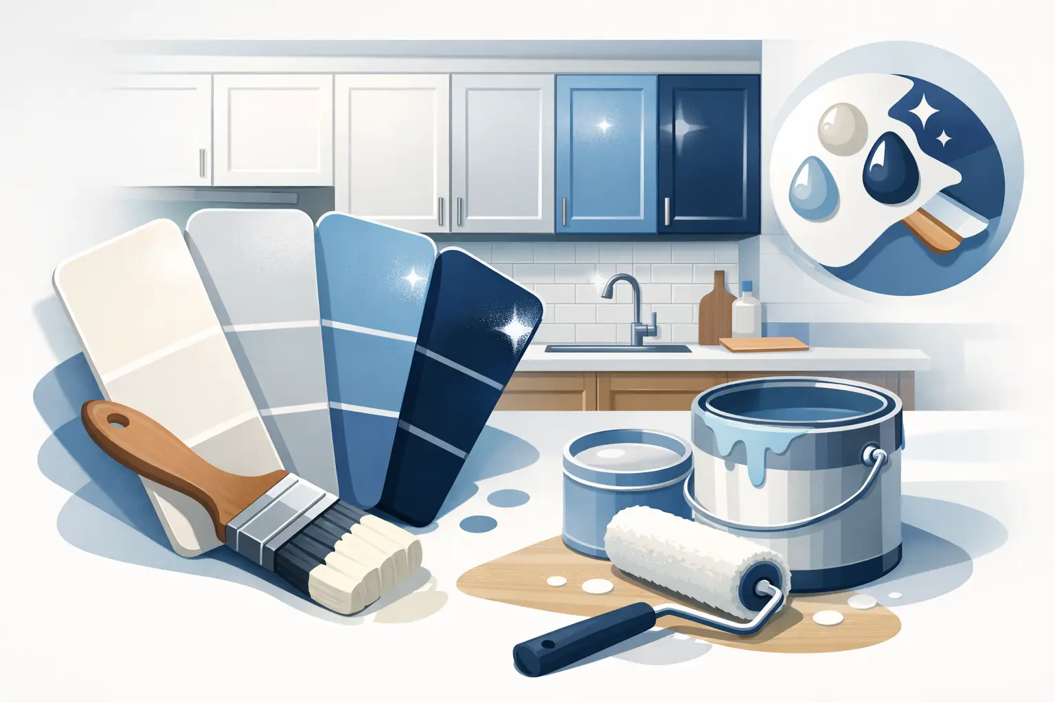
How to choose the right shade for your kitchen
Start with the fixed elements you are keeping. Your floor, worktop, tiles and even adjacent wall colours should guide the undertone you choose. If those elements are warm, a warm cabinet colour will usually sit better. If they are cool and contemporary, a cleaner grey or soft blue may make more sense.
Then think about light. A shade that looks perfect on a sample card can change completely once it is on full cabinet doors. Test colours in natural daylight and under evening lighting. Small kitchens are affected by these shifts more than larger rooms because every surface is doing more visual work.
Finally, be honest about the look you want to live with. Trend-led shades can be appealing, but kitchens are hard-working spaces. The best choice is often the one that still feels attractive and practical after the novelty wears off.
Finish matters as much as colour
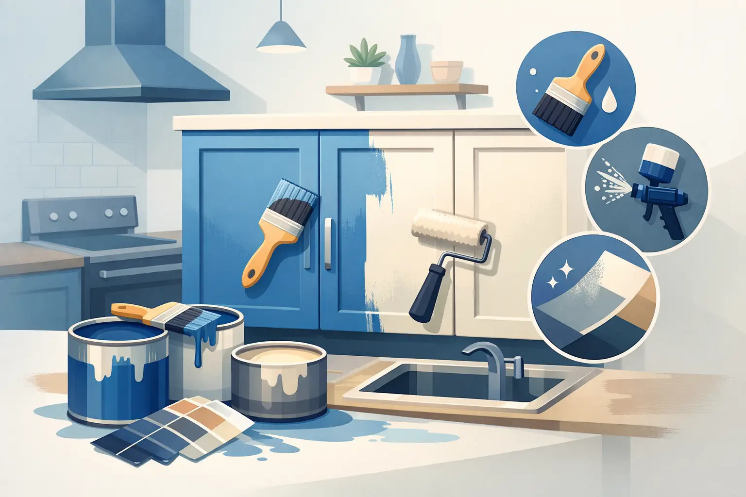
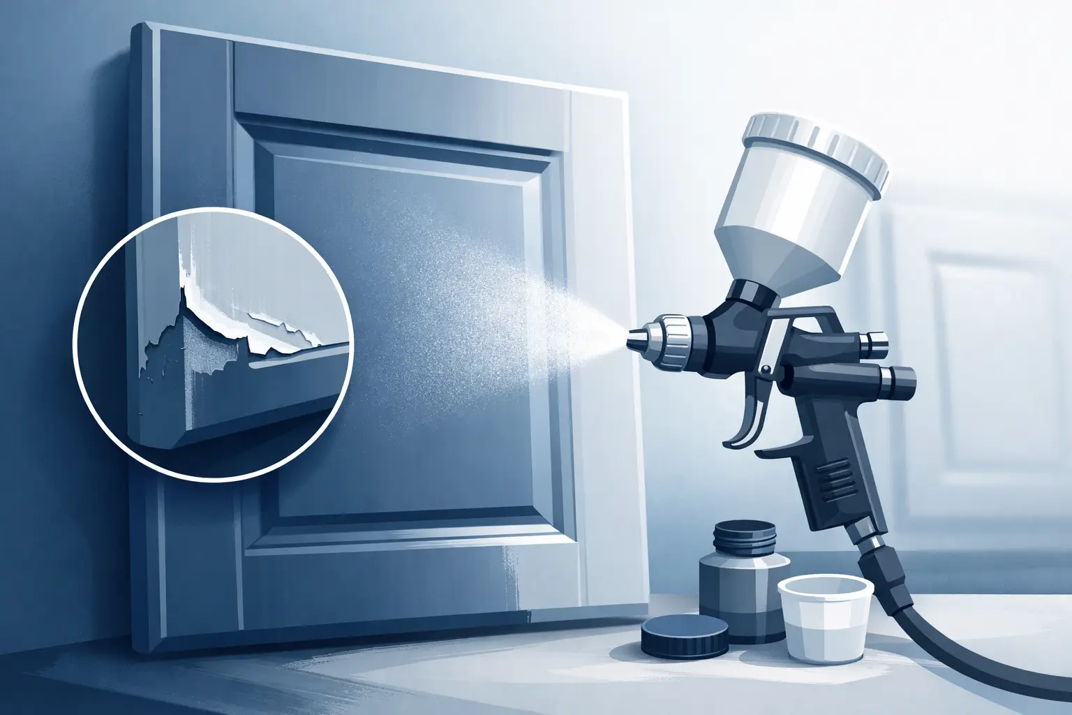
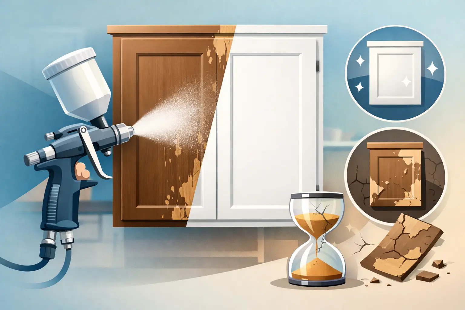
When people talk about the best colours for small kitchens, they often focus only on shade. Finish matters just as much. A professionally sprayed finish gives a smooth, factory-like look that helps cabinetry reflect light more evenly and makes the whole room feel sharper.
That is especially valuable in smaller kitchens, where every detail is more visible. Brush marks, uneven coverage and poorly chosen paint sheen can make a compact space feel untidy. A clean, durable sprayed finish gives the colour its best chance to perform well.
For many homeowners, this is the smart middle ground. Instead of replacing solid units that still have plenty of life in them, respraying can deliver a stunning visual transformation at a far more affordable cost, with less waste and far less disruption.
The right kitchen colour will not create square footage that is not there. What it can do is make the room feel lighter, calmer and more generous every time you walk into it, and that is often the difference that matters most.