You know the feeling: the layout of your kitchen still works, the units are solid, but the colours date the whole room. Maybe it’s the heavy oak that makes everything feel darker than it should, or a once-fashionable cream that now reads tired under modern lighting. The good news is you don’t need a full renovation to get a kitchen that feels brand new. With the right planning, custom kitchen colour schemes can transform the space you already have—quickly, affordably, and without ripping out cabinetry that still has years of life in it.
What makes a colour scheme “custom” isn’t picking a trending shade and hoping for the best. It’s building a palette that suits your home’s light, your worktops, your floors, and how you actually use the kitchen day to day. Get it right and the finish looks intentional and high-end. Get it wrong and even a perfect paint job can look slightly “off”, because the undertones fight each other.
What “custom” really means in kitchen colour
A custom scheme starts with the fixed elements you’re not changing—or don’t want to change. In many homes across Dublin and surrounding counties, that’s the worktop, tiles, flooring, and sometimes appliances. Once you accept what’s staying, you can choose colours that complement those materials rather than competing with them.
Custom also means thinking in surfaces, not paint charts. Kitchens are a mix of large blocks (doors and panels), horizontal planes (worktops), and reflective elements (handles, taps, splashbacks). A colour that looks calm on a small swatch can feel much stronger across a bank of tall units. Likewise, a “neutral” can turn green, pink, or grey depending on the light and what’s beside it.
Finally, custom means choosing a finish that matches the mood you want and the practicality you need. A sleek contemporary kitchen often wants a smoother, more uniform look; a busy family kitchen needs durability and a finish that’s easy to wipe down without showing every fingerprint.
Start with light, not paint
If you take one step before choosing colours, let it be this: look at your kitchen across the day. North-facing kitchens tend to lean cooler and can make some greys feel flat or a little blue. South-facing kitchens can warm up colours and sometimes push creamy tones towards yellow.
Artificial lighting matters too. Warm white bulbs can soften stark whites and make darker colours feel richer. Cooler lighting can sharpen whites and highlight any cool undertones in greys and blues. If you’re changing lighting soon, decide that first—otherwise you risk choosing a colour to “fix” a lighting problem.
A simple practical approach is to pick a main cabinet colour that looks good in the dullest light your kitchen gets (often a winter afternoon). If it holds up there, it will usually look even better the rest of the time.
Choosing the anchor: cabinets, worktops, or floors?
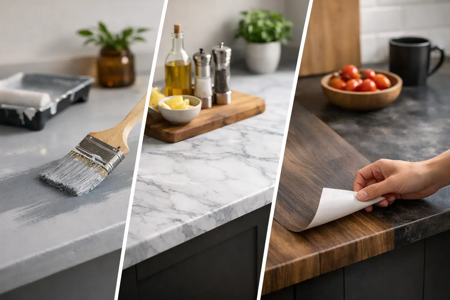
Most kitchens have one visual anchor. In some homes it’s the worktop, especially if it’s a strong pattern. In others it’s the floor, particularly if it’s timber or a bold tile. If your worktop has movement—speckles, veining, or a mixed pattern—your cabinet colour should generally be calmer. If the worktop is more uniform, you have more freedom with cabinet colour.
You’ll also want to check undertones. A “white” worktop might be crisp and cool, or warm and creamy. Pairing a cool white worktop with warm cream cabinets can look unintentional. Pairing a warm worktop with a cool grey can feel slightly clinical. It’s not that you can’t mix warm and cool, but you need a deliberate bridge—often in the wall colour, handles, or splashback.
Custom kitchen colour schemes that work in real homes
1) Warm neutrals for a brighter, softer kitchen
Warm neutrals—think soft whites, oat, mushroom, greige—are popular because they lift a room without feeling stark. They suit homes where you want a calm, welcoming kitchen that won’t date quickly.
The trade-off is that warm neutrals are sensitive to lighting. Under warm bulbs they can look cosy; under cool bulbs they can look slightly muddy. If you choose this route, it helps to keep the worktop and splashback relatively clean and light so the whole scheme reads fresh rather than beige.
2) Two-tone cabinetry for depth without heaviness
Two-tone kitchens are ideal when you want colour, but you’re wary of making the room feel smaller. A common approach is lighter wall units with darker base units. The eye reads the lighter top half first, which keeps the room feeling open, while the darker base adds weight and practicality.
A navy or deep green on base units can look stunning against a warm white above, especially with brushed brass or satin nickel hardware. Just be realistic about maintenance: very dark colours can show dust and marks more easily, particularly around handles. The right professional finish makes cleaning easier, but the colour choice still affects what you notice day to day.
3) Deep greens and blues for a confident, high-end look
If you love a statement kitchen, deep greens and blues can give that “designer” feel—especially when paired with warm timber, soft stone tones, or a spray granite worktop finish. These colours suit larger kitchens or open-plan spaces where you want the kitchen to hold its own.
They’re not only for big rooms, though. In smaller kitchens, darker colours can look dramatic and intentional, provided you balance them with good lighting and lighter walls or worktops. The key is avoiding a cave effect: reflective surfaces, lighter splashbacks, and carefully placed lighting help the colour feel rich rather than heavy.
4) Soft greys for a modern, flexible base
Grey can still be a great choice when it’s chosen carefully. The best greys for kitchens tend to have a hint of warmth, which stops them feeling cold in Irish light. Grey is also flexible: it works with stainless steel appliances, most floors, and a wide range of wall colours.
The risk is picking a grey that looks perfect on a sample but turns lilac, blue, or green on your doors because of surrounding colours. This is where testing and comparing against your worktops and tiles really pays off.
How to make a scheme look intentional (not “done in stages”)
The kitchens that look professionally designed usually have a clear hierarchy: a main cabinet colour, one supporting tone, and one accent finish. When there are too many competing elements—multiple metals, clashing undertones, and strong wall colours—the result can feel busy, even if each item is nice on its own.
Handles are a small detail that make a big difference. If your scheme is warm (creams, greiges, deep greens), brass and warmer metals often feel natural. If your scheme is cooler (crisp whites, blue-greys), chrome or stainless can keep it clean and contemporary. Black can work in both, but it reads bolder and can make a softer scheme feel more graphic.
Walls matter too. If you’re respraying cabinetry, keep wall colours supportive. It’s easier to change paint on walls later than cabinetry, so it makes sense to be more adventurous on walls only if you’re confident you’ll love it long term.
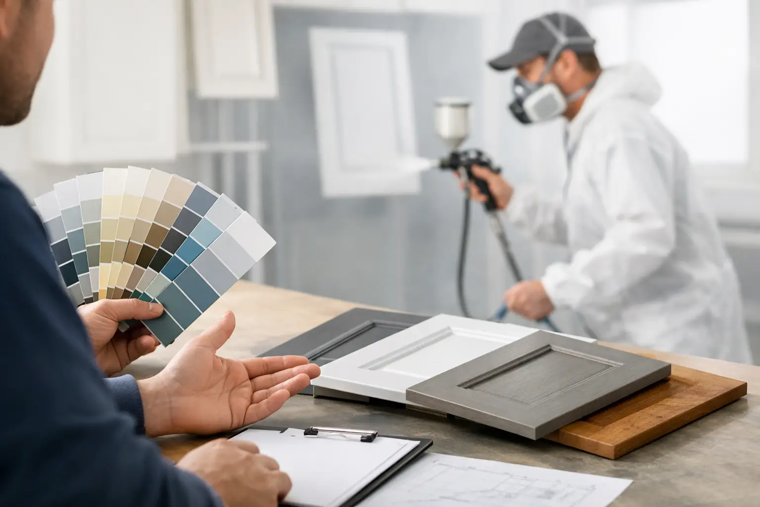
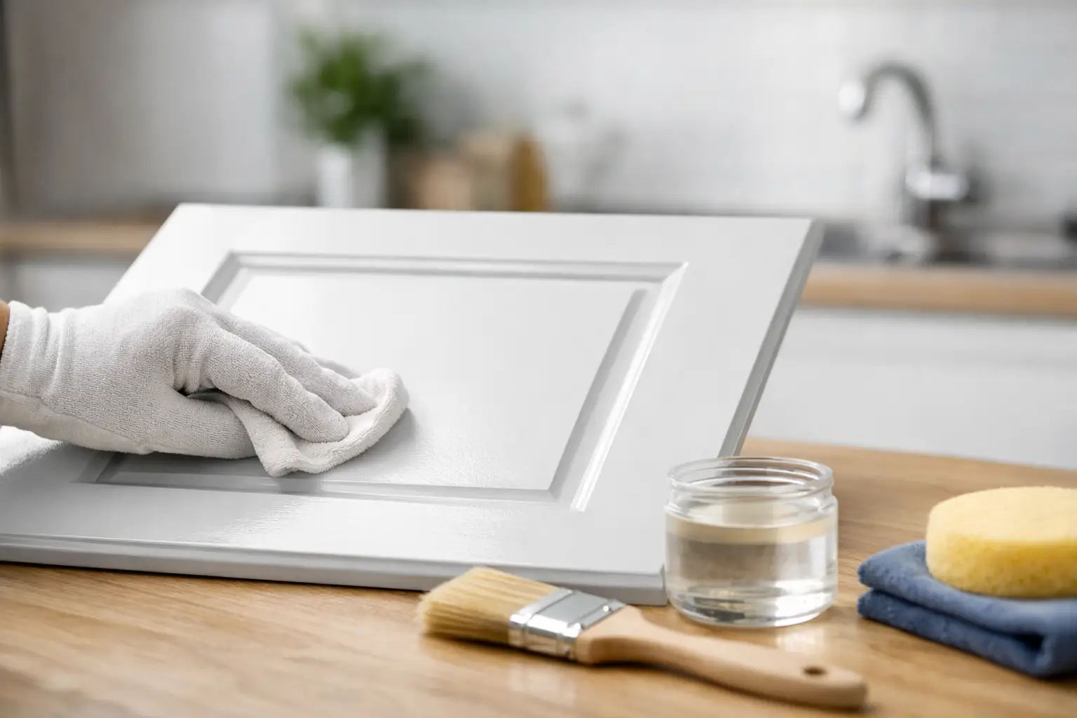
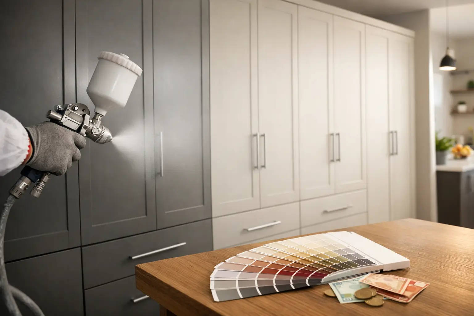
Respraying: the practical route to a bespoke look
A lot of homeowners assume that a “custom” colour scheme requires new doors. In reality, respraying is often the smarter path when your kitchen is structurally sound. You get the tailored colour you want, the finish can look like a factory-applied coating when done professionally, and you avoid the disruption and waste of ripping out a perfectly serviceable kitchen.
This is especially useful if you’re updating more than colour—perhaps modernising oak to a clean painted finish, or bringing dated units into line with a new worktop. A professional service can also help you choose a colour that works with your existing fixed elements, so the scheme feels planned rather than pieced together.
If you’re in Dublin or nearby counties and want advice grounded in real-world finishes (not just a mood board), Dublin Kitchen Respray specialises in expert, durable resprays that deliver a stunning transformation without the cost and hassle of a full renovation.
The “it depends” factors people forget
Colour choice isn’t only about taste. It depends on how you live.
If you cook frequently, you’ll want a finish that handles regular wiping near the hob and sink. If you have young children, mid-tones can be forgiving—very light colours show scuffs, and very dark colours show dust and fingerprints. If you’re planning to sell in the next few years, a timeless neutral with one confident accent often gives broad appeal while still feeling upgraded.
It also depends on continuity. In open-plan homes, the kitchen colour scheme needs to sit comfortably with the living and dining area. That doesn’t mean everything must match; it means the undertones should make sense together. A kitchen that leans warm next to a living room that leans cool can feel slightly jarring unless there’s a bridge in textiles, flooring, or wall colour.
A simple way to choose confidently
Before you commit, look at your top two or three cabinet colours next to your worktop and floor, in daylight and under your evening lighting. If one option consistently feels calmer and more “right”, that’s usually the one you’ll enjoy living with.
And give yourself permission to choose what suits your home rather than what’s trending. The most successful custom kitchen colour schemes aren’t the loudest—they’re the ones that make the kitchen feel naturally upgraded every time you walk in, without you having to explain what you were aiming for.
If you’re standing in your kitchen right now thinking, “Everything is fine… it just looks tired,” that’s actually a great place to be. It means a thoughtful change of colour can do the heavy lifting—and you get to keep the kitchen that already works for your life.