Your cabinets take up more visual space than almost anything else in a kitchen, so if the colour feels off, the whole room can feel unsettled. That is why knowing how to choose cabinet colour scheme options carefully matters so much. Get it right and the kitchen feels brighter, more expensive and better organised, without the cost and disruption of a full renovation.
For most homeowners, the challenge is not a lack of choice. It is too much choice. Soft white, warm greige, navy, sage, mushroom, charcoal, cashmere – all of them can look excellent in the right setting, and disappointing in the wrong one. The best decisions come from reading the room properly before falling for a paint card.
How to choose cabinet colour scheme by starting with the fixed elements
A cabinet colour should not be chosen in isolation. Start with the parts of the kitchen that are staying as they are, because they will set the limits of what works. Worktops, flooring, splashbacks, wall tiles and even large appliances all affect how a cabinet shade reads.
If your floor has warm undertones, such as honey oak, beige stone or cream porcelain, very icy cabinet colours can look sharp and disconnected. In that case, warmer whites, taupe tones, soft olive or greige usually sit more comfortably. If your kitchen already has cooler materials, like grey quartz, polished concrete tones or chrome details, a cleaner white, slate blue or graphite can feel more natural.
This is where many people go wrong. They choose a cabinet colour they loved in someone else’s home without noticing that the surrounding finishes were completely different. A stunning shade on social media may not suit your own light, floor or worktop.
Light changes everything
Natural light has a huge impact on cabinet colour. A shade that looks airy in a bright south-facing kitchen may appear flat in a darker room. Equally, a colour that seems modest on a sample can become much stronger once it covers every cabinet door.
In kitchens with limited daylight, lighter tones usually work harder. They help bounce light around the room and make the space feel cleaner and more open. That does not mean you are restricted to plain white. Soft stone, putty, pale sage and warm grey can all brighten a room while adding more character.
In brighter kitchens, you have more freedom. Deeper greens, blues and charcoals can look rich rather than heavy, especially when balanced with lighter walls or worktops. If you want drama but are unsure about going fully dark, a two-tone scheme often gives you the best of both worlds.
Artificial lighting matters too. Warm bulbs can make creamier shades feel inviting, but may turn some greys muddy. Cooler LEDs can sharpen modern schemes, but they may make warm neutrals look dull. Always check samples in daylight and at night before you commit.
Match the colour scheme to the style of kitchen
The most successful cabinet colour schemes feel as though they belong to the house. That does not mean you have to play safe, but the finish should still suit the architecture and overall look of the room.
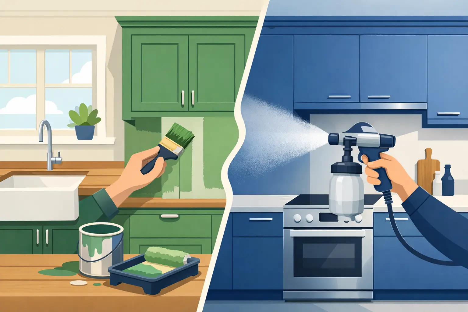
For a classic kitchen, warm whites, muted greens, soft blues and mushroom tones tend to have lasting appeal. These colours work particularly well with shaker doors, timber accents and more traditional handles. They feel elegant without trying too hard.
For a contemporary kitchen, sharper contrasts can be more effective. Matt white with charcoal, deep navy with pale quartz, or a clean greige paired with black hardware can all look polished and current. Flat-panel doors usually suit these simpler, more defined schemes.
If your home sits somewhere in between, which many do, the safest route is a balanced neutral with one stronger accent. That could mean cashmere cabinets with a darker island, or a pale grey run of units with a deeper pantry section. This gives the kitchen personality while keeping it easy to live with.
Think about everyday practicality, not just the sample card
A cabinet colour has to work on a busy Tuesday morning, not just in a styled photo. That is why practicality should sit alongside style when making your choice.
Very dark cabinets can look sophisticated, but they tend to show dust, fingerprints and splashes more easily, especially in a family kitchen. Brilliant white can feel fresh and clean, but some finishes highlight marks around handles and lower cabinets. Mid-tones often strike the best balance, particularly if you want a kitchen that still looks smart between cleans.
The finish also affects how forgiving the colour will be. Matt finishes are popular because they look modern and refined, but they can show grease or scuffs more than expected in certain shades. Satin or low-sheen finishes can be easier to maintain while still looking premium.
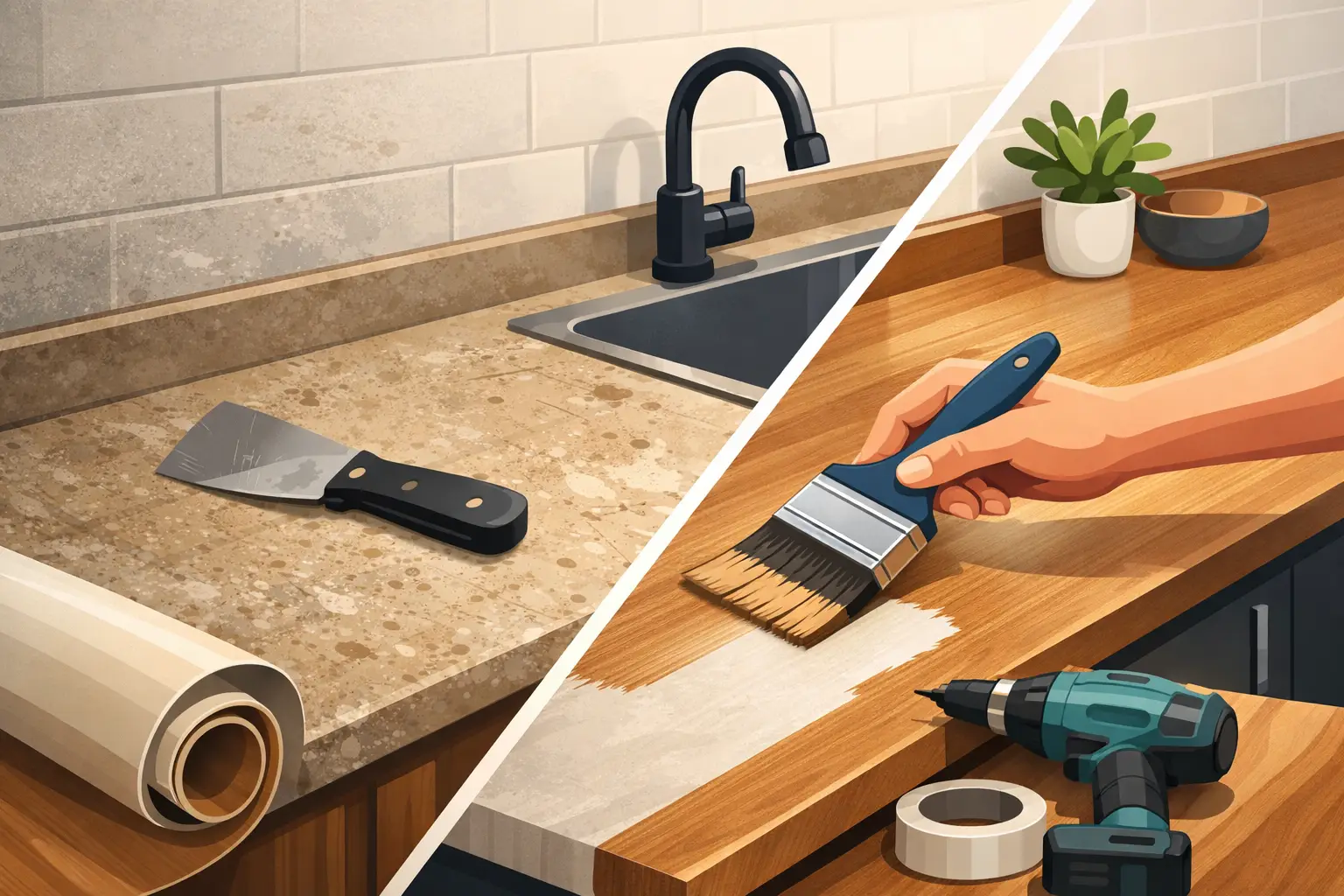
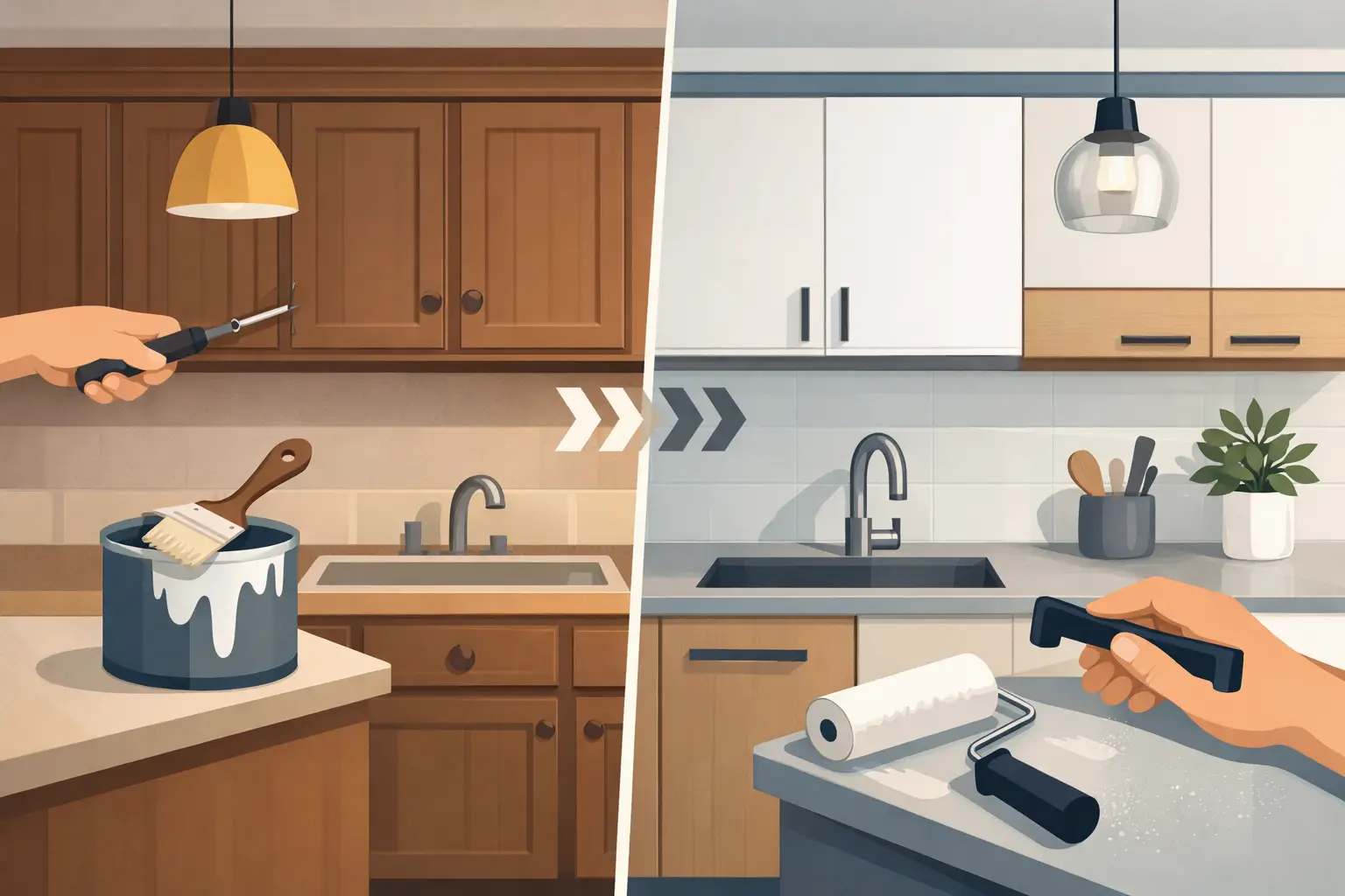
This is one reason professional respraying appeals to many homeowners. You can refresh the look of the kitchen with a durable, factory-style finish, while keeping the cabinets you already have. It is a practical way to update the colour scheme without turning the house upside down.
Should you choose one colour or two?
Single-colour kitchens are often the calmest option. They suit smaller spaces particularly well because they reduce visual clutter and make the room feel more unified. If your kitchen is compact, or if you want a timeless result, one carefully chosen shade across all cabinetry can work beautifully.
Two-tone schemes are useful when you want more depth. A common approach is lighter wall cabinets with darker base units. This keeps the upper half of the kitchen feeling open while grounding the space below. Another option is to make the island or dresser section the feature colour, especially in larger open-plan rooms.
The trade-off is that two-tone schemes need more discipline. The colours should clearly relate to each other and to the rest of the room. If both shades compete for attention, the kitchen can start to feel busy. Usually, one colour should lead and the other should support it.
The shades that tend to last
Trends change quickly, but most homeowners want a cabinet colour that still feels right in five or ten years. In our experience, the longest-lasting schemes are the ones that sit slightly back rather than demanding constant attention.
Warm white remains a dependable choice because it suits most worktops and keeps a kitchen feeling fresh. Greige and taupe are also strong options if you want softness without going too cream or too grey. Sage and muted blue have become favourites because they bring colour in a restrained, easy-to-live-with way.
That said, timeless does not have to mean bland. A deeper colour like navy or forest green can still have real longevity if the room supports it. The key is avoiding shades that feel too synthetic or overly fashionable. If the colour is the only thing making the kitchen look current, it may date quickly.
How to test cabinet colours properly
One small sample is rarely enough. Cabinet colours cover a large area, so test bigger swatches wherever possible and move them around the kitchen. Hold them next to the floor, the worktop and the tiles. Look at them in morning light, afternoon light and under your usual evening lighting.
It also helps to compare similar shades directly. A white can look perfect until it sits beside a slightly warmer white that suddenly feels much more comfortable. The same is true for greys, greens and neutrals. Small differences in undertone make a big difference once the kitchen is finished.
If you are respraying existing cabinets, think about the whole transformation rather than the paint alone. Handles, walls and worktops all influence the result. Sometimes the right cabinet colour is not the boldest one, but the one that makes everything else in the room look better.
When expert advice makes the decision easier
Choosing cabinet colours can feel surprisingly technical because it sits at the intersection of design, lighting and everyday use. A professional eye can often narrow the options quickly by spotting undertones, balance issues and finishes that will suit the space best.
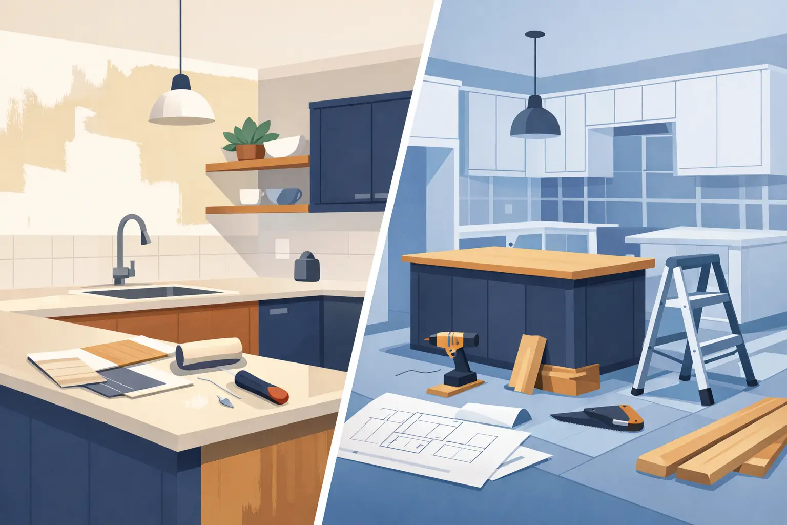
For homeowners across Dublin and nearby counties, this can be especially useful when updating a kitchen through respraying rather than replacement. With the right preparation and finish, existing cabinets can be given a completely new character at a far more affordable cost than a full refit. That makes the colour decision even more worthwhile, because a well-chosen scheme can transform the room while keeping the bones of a kitchen that still works.
If you are stuck between two shades, the better choice is usually the one that suits your fixed surfaces, your light and your daily routine – not the one that shouts the loudest on a trend board. A beautiful kitchen is not built around guesswork. It comes from colours that feel right every time you walk in.