The quickest way to make a kitchen feel expensive, balanced and properly considered is to get the relationship between the cabinets and worktops right. Even beautifully sprayed doors can look flat beside the wrong surface, while an older kitchen can feel completely refreshed when those two elements work together.
If you are deciding how to match worktop to cabinets, the answer is rarely to make everything the same. The better approach is to create contrast, balance and a sense of purpose. That means looking at colour, undertone, light, texture and how you actually use the kitchen day to day.
How to match worktop to cabinets without guesswork
Start by treating the cabinets as the biggest visual block in the room. Their colour sets the tone. The worktop then either softens it, sharpens it or grounds it.
Light cabinets such as warm white, cream, soft grey or greige are usually the most flexible. They work well with timber-effect worktops for warmth, marble-look finishes for a brighter and more classic feel, or darker stone-look surfaces if you want more contrast. If your kitchen feels plain, the worktop is often where personality can be introduced.
Darker cabinets need a little more care. Navy, charcoal, forest green and black can look stunning, but the worktop needs to stop the room feeling heavy. A lighter surface with subtle movement often does that best. Pale stone, off-white and soft concrete tones all help to lift deeper cabinetry without losing the polished look.
Where people often get stuck is matching by colour alone. Two greys can clash if one has a blue undertone and the other leans brown. Two whites can fight if one is crisp and cool while the other is creamy. Undertone matters as much as the main shade.
Begin with undertones, not just colours
A cabinet colour may read as simple grey, but in daylight it might show green, taupe or blue. The same applies to worktops. Quartz, laminate, spray granite and stone-effect surfaces all have underlying tones that affect the final result.
Warm cabinet colours generally pair best with worktops that also carry warmth. Think ivory, beige, sand, taupe and timber tones. Cool cabinet colours usually sit more comfortably with whites, soft greys, charcoal, slate and marble-style surfaces with cooler veining.
That does not mean warm and cool can never mix. Sometimes that contrast is exactly what gives a kitchen its edge. But it needs to look intentional. A warm cashmere cabinet beside an icy blue-grey worktop can feel slightly off unless another part of the room ties those tones together, such as flooring, splashback tiles or metal finishes.
A simple test helps here. Look at your cabinet sample and worktop sample together in morning light, afternoon light and artificial light. In many Dublin homes, natural light shifts throughout the day and can change how a finish reads more than people expect.
Decide whether you want contrast or continuity
Most successful kitchens sit somewhere between contrast and continuity. Too much contrast can look busy. Too much sameness can make the room feel flat.
If your cabinets are plain in style, a more detailed worktop can add interest. A marble-look pattern, stone fleck or textured spray finish gives the kitchen movement without changing the cabinet design. If your cabinet fronts are already quite detailed, a quieter worktop often looks more refined.
For a calm, timeless look, keep the cabinet and worktop within the same tonal family but vary the depth. Soft beige cabinets with a slightly deeper stone-effect worktop work well. Pale grey cabinets with a white or light concrete worktop also create a gentle, elegant finish.
For a bolder effect, separate the two clearly. White cabinets with a charcoal worktop are classic. Deep green cabinets with a pale stone surface feel rich but still fresh. Navy with white marble-effect worktops remains popular because it creates strong contrast without looking harsh.
Texture and finish matter more than most people think
When homeowners focus only on colour, they can miss the part that makes a kitchen feel premium. Texture changes everything.
Matt cabinets paired with a matt or lightly textured worktop usually feel modern and understated. Gloss or satin cabinets can benefit from a more muted worktop, so the room does not become overly reflective. If both surfaces are shiny, the kitchen can feel colder and every fingerprint becomes more noticeable.
This is also where practicality comes in. A very dark polished worktop may look striking in a showroom, but in a busy family kitchen it can show crumbs, smears and water marks quickly. Lighter mid-tone finishes often prove easier to live with. Likewise, heavily patterned surfaces can hide mess well, but too much movement may compete with the cabinets.
A professional finish should suit both the look you want and the level of maintenance you are happy with. There is no perfect answer for everyone.
Popular cabinet and worktop pairings that work
Some combinations stay popular because they are dependable and versatile. White or off-white cabinets with wood-effect worktops bring warmth into kitchens that might otherwise feel clinical. This works especially well in homes where the room gets limited natural light.
Grey cabinets with white or marble-look worktops offer a clean, contemporary feel. If the grey is warm, choose softer whites rather than brilliant white. If the grey is cooler, crisper white can work beautifully.
Navy cabinets with pale stone or marble-effect worktops create depth and contrast. Brass or brushed steel handles can then steer the scheme warmer or cooler.
Green cabinets pair particularly well with worktops that feel natural – warm white, limestone tones, pale terrazzo looks or timber effects. The key is to stop the green from becoming too dark or too earthy unless that is the atmosphere you want.
Cashmere, taupe and greige cabinets often look best with worktops that are either slightly lighter for a soft layered finish or distinctly darker for definition. Trying to match them too exactly can make the whole kitchen blur together.
Think about the rest of the room
A worktop does not only need to match the cabinets. It needs to belong in the kitchen as a whole.
Flooring is a common issue. If you already have a warm oak floor, adding a second timber-effect worktop in a different tone can clash. In that case, a painted cabinet and stone-look worktop often create better balance. If your floor is a cool tile, a warmer worktop can stop the room feeling stark.
Splashbacks matter too. If you plan to use bold tiles, keep the worktop simpler. If the splashback will be plain, the worktop can take on more visual interest.
Hardware and appliances also influence the final look. Black handles, stainless steel ovens, brass taps and chrome sockets each pull the scheme in a slightly different direction. The best kitchens do not match every element exactly, but they do feel consistent.
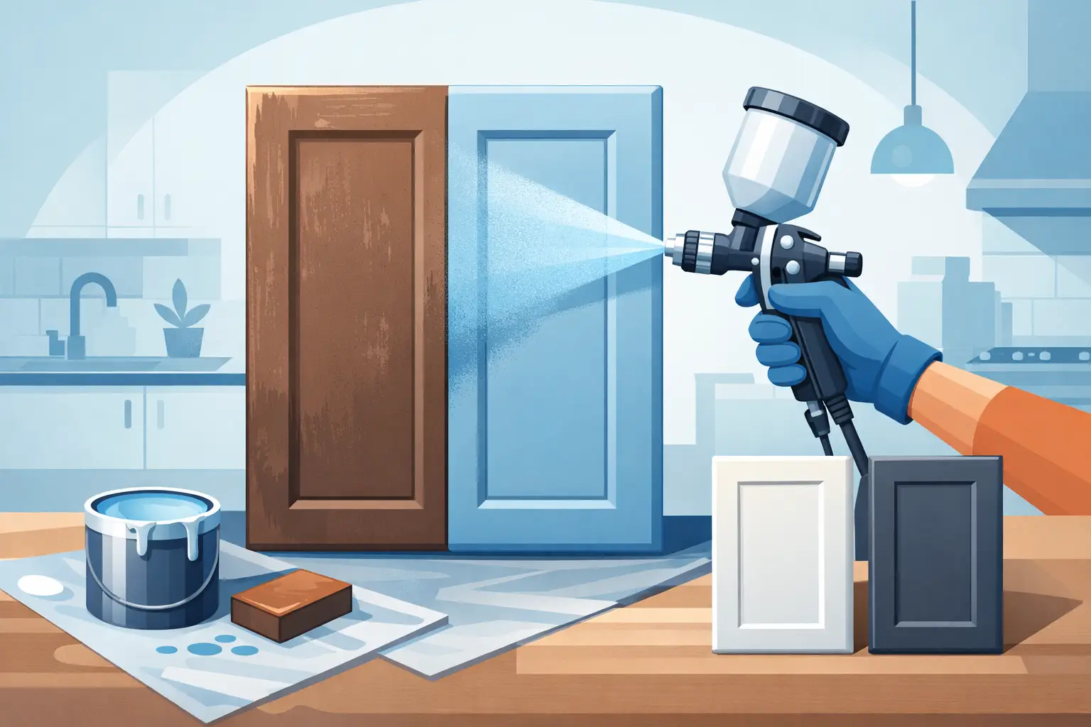
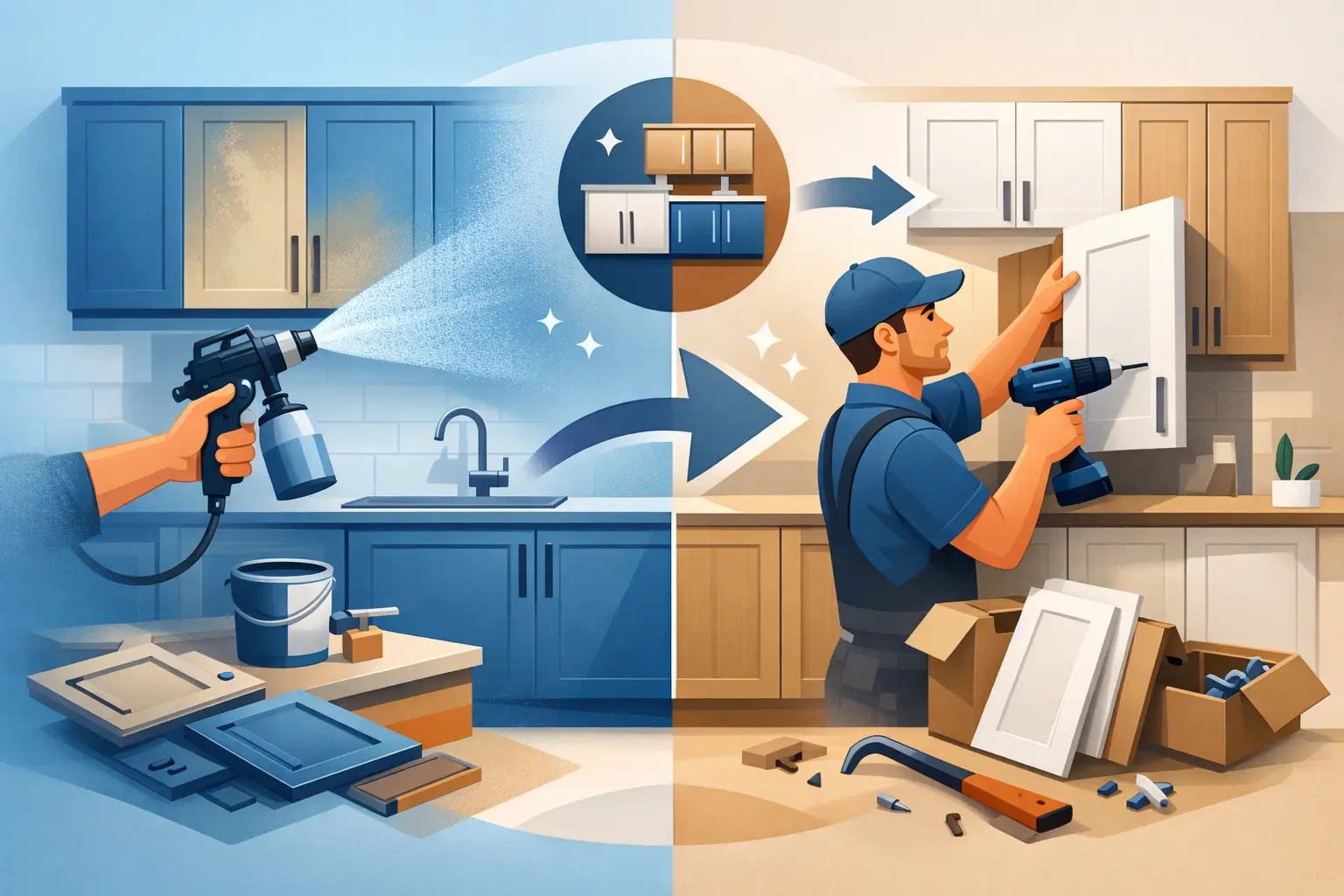
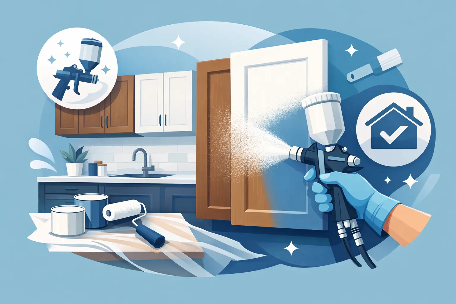
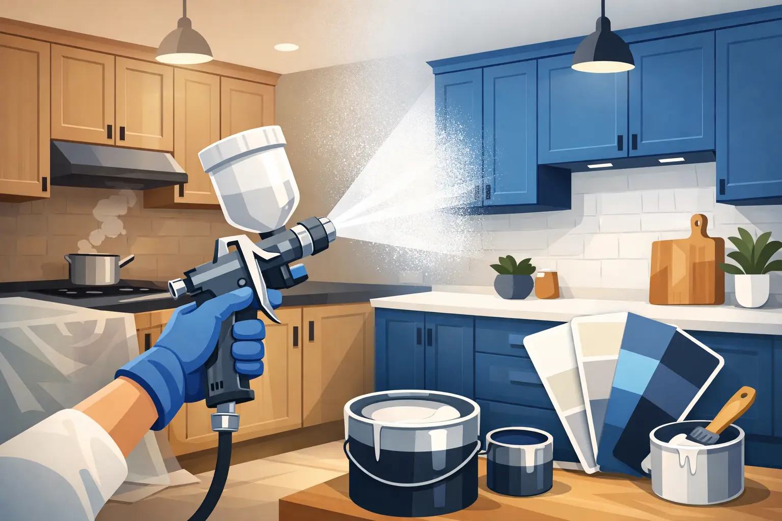
When respraying changes the answer
One of the biggest advantages of respraying cabinets is flexibility. If the doors are structurally sound but the kitchen feels dated, changing the cabinet finish can open up far more worktop options without the cost and disruption of a full refit.
This is often the smarter route when the existing layout works well but the colours do not. Instead of replacing cabinetry, homeowners can update the cabinet colour and choose a surface finish that complements it properly. For example, dark oak units that make a room feel heavy can be professionally resprayed in a soft light tone, allowing the existing worktop to feel more current. In other cases, pairing freshly sprayed cabinets with a renewed worktop finish gives the whole kitchen a stunning result at a far more affordable price.
For homeowners who want the look of stone without replacing the full surface, spray granite can be a practical option. It gives worktops a durable, refreshed appearance and can help tie older kitchens together visually. That is especially useful when you like your cabinet layout but need the room to look cleaner, brighter and more up to date. At Dublin Kitchen Respray, this is often where customers see the biggest transformation for the least upheaval.
Avoid the most common mistakes
The biggest mistake is choosing samples in isolation. A worktop that looks perfect under showroom lighting may not suit your cabinet colour at home. Always compare materials together in your own kitchen.
The second is overmatching. Cabinets, worktops, flooring and splashback all in almost the same tone can leave a kitchen looking washed out. You need some variation in depth, texture or pattern.
The third is ignoring practical use. A family kitchen, a rental property and a low-traffic show kitchen all need different things. If you cook daily, wipe surfaces constantly and have children using the space, durability and ease of cleaning deserve equal weight alongside appearance.
A well-matched kitchen should look good straight away, but it should also still feel right six months later on an ordinary Wednesday.
If you are unsure, aim for balance rather than trend. A cabinet colour you genuinely like, paired with a worktop that suits its undertone and the way you live, will nearly always outlast the latest fashion.